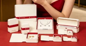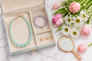
Cultural traditions shape the colors, materials, symbols, and forms in jewelry packaging. These elements drive brand differentiation and consumer connection. A fabricant d'emballages pour bijoux understands that cultural context helps packaging design resonate emotionally. This approach builds lasting loyalty. Brands ignoring cultural traditions risk alienating audiences and losing regional advantage. The interplay between tradition and modern expectations shapes every successful packaging design decision. A boîtes à bijoux personnalisées maker sees how cultural identity influences emballage de bijoux. Social perceptions affect willingness to pay a premium. Each jewelry display et jewelry pouch reflects this balance. The cultural design of premium tea packaging offers similar lessons for packaging design and cultural identity.
How Cultural Traditions Define Luxury in Jewellery Packaging
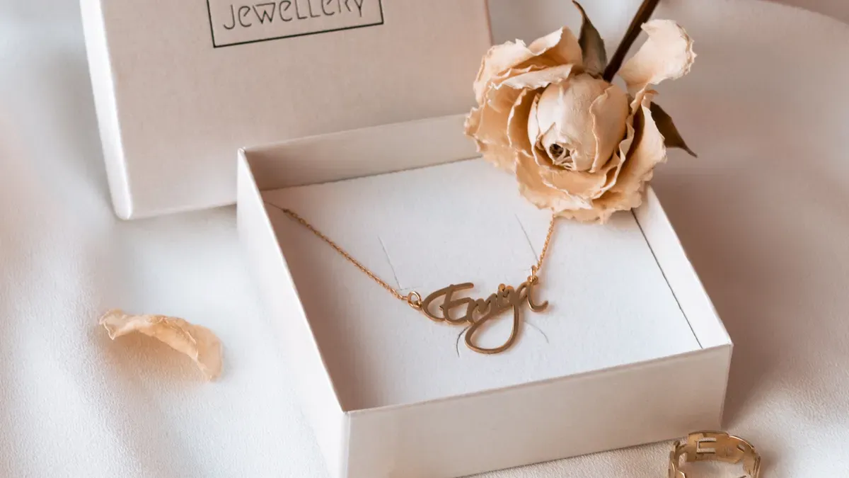
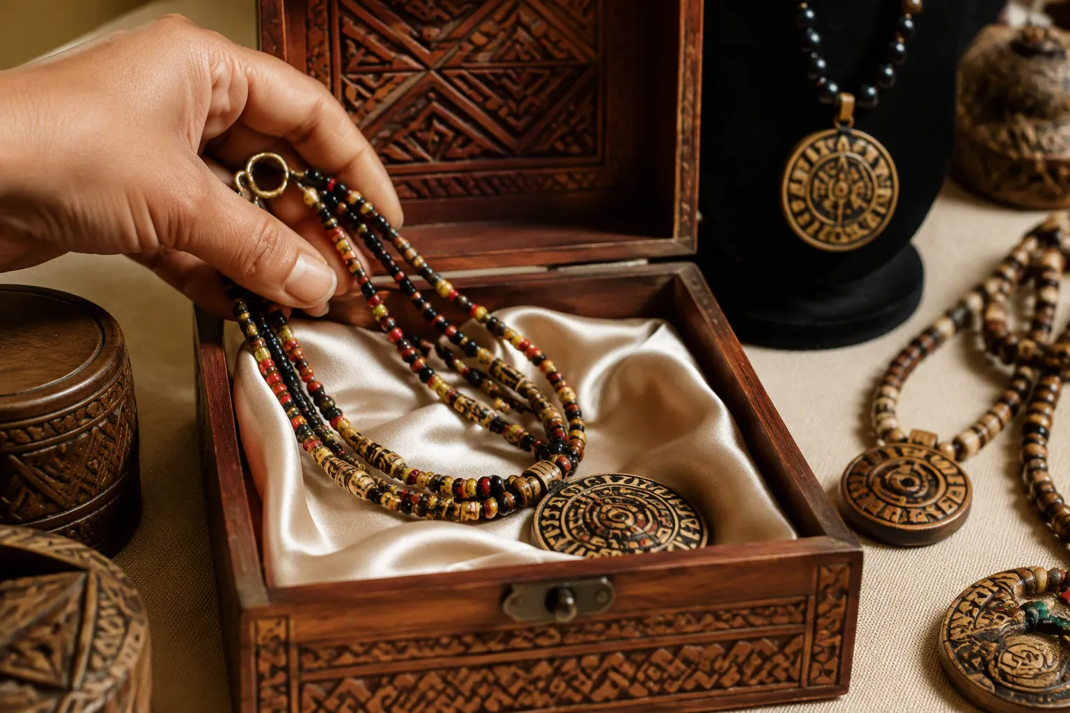
Cultural traditions determine what consumers consider luxurious. A red box signals prosperity in Shanghai. A plain wooden box signals refinement in Kyoto. These differences shape every jewelry packaging decision. Brands that understand cultural perceptions of luxury create packaging design that feels authentic. Brands that ignore these differences create packaging design that feels foreign. This section examines how Eastern, Western, Middle Eastern, and African traditions define luxury in jewelry packaging.
Eastern Perceptions of Luxury
Eastern cultures often link luxury to symbolism, material richness, and spiritual meaning. Consumers in these markets expect jewelry packaging to carry cultural meaning beyond mere protection. The packaging design must reflect values that communities hold dear. Cultural symbolism drives purchasing decisions in these regions. A brand that respects these traditions earns trust. A brand that ignores them loses ground.
Chinese Red and Gold for Prosperity
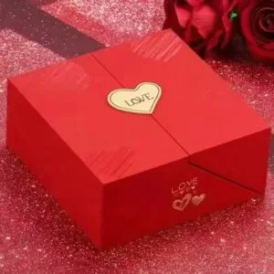
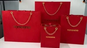
Red dominates Chinese luxury packaging design. Darker reds signal higher status. Red also symbolizes luck, prosperity, joy, and celebration in Chinese culture. Gold accents reinforce these themes. Together, they create jewelry packaging that feels auspicious and valuable.
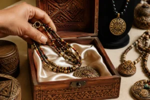
Material choices matter equally. Velvet makes colors richer and more elegant. Lacquered finishes add shine and brightness. Wooden boxes give a warm, natural feel. Each material contributes to the overall sense of luxury.
| Marker | Luxury effect |
|---|---|
| Red shades | Darker reds are positioned as luxurious; red also symbolizes luck, prosperity, joy and celebration in Chinese culture |
| Material effects | Velvet makes colors richer and more elegant; lacquered finishes add shine and brightness; wooden boxes give a warm, natural feel |
Chinese consumers often give jewelry as gifts during weddings and festivals. The packaging design must honor the occasion. Red and gold packaging design communicates respect and good wishes. This approach strengthens cultural identity and builds brand loyalty. Consumers show greater willingness to pay a premium when packaging design aligns with their values.
Japanese Minimalism and Wabi-Sabi
Japanese luxury takes a different path. Wabi-sabi aesthetics value simplicity, natural beauty, and imperfection. Packaging design reflects this philosophy through clean lines and understated elegance. Rustic and natural materials replace ornate decoration. Wood grain and unbleached paper convey refinement.
Japanese consumers appreciate restraint. A simple wooden box with a single ribbon can feel more luxurious than a heavily decorated alternative. This packaging design respects cultural heritage while meeting modern expectations. The minimal approach also supports sustainability goals. Japanese consumers show strong willingness to pay a premium for packaging design that honors these values.
| Culture | Visual marker | Material marker | Cultural/luxury connotation |
|---|---|---|---|
| Chinese | Rouge | Silk is not named; red is the dominant visual cue | Red signifies good luck and prosperity; used for festival and wedding jewelry packaging |
| Japanese | Simple patterns | Rustic/natural materials | Embodies wabi-sabi aesthetics, valuing simplicity and natural beauty |
Indian Opulence and Ornamentation
Indian jewelry packaging embraces richness and decoration. Vibrant colors, intricate patterns, and luxurious fabrics define the aesthetic. Gold and deep jewel tones appear frequently. Ornate boxes reflect the value of the jewelry inside.
Indian weddings drive significant demand for elaborate packaging design. The packaging design must match the grandeur of the occasion. Silk pouches, velvet boxes, and gold foil stamping communicate respect and celebration. Cultural elements like paisley motifs and mandala patterns add depth. Consumers demonstrate strong willingness to pay a premium for packaging design that reflects their cultural identity.
Western Perceptions of Luxury
Western cultures often define luxury through restraint, brand heritage, and exclusivity. European and American markets share some values but differ in execution. Understanding these distinctions helps brands create effective packaging design for each region.
European Elegance and Understatement
European luxury favors subtlety. Minimalist packaging design with high-quality materials signals refinement. Recycled paper and biodegradable inks now appear in emballages pour bijoux de luxe across the continent. Brands integrate sustainability into their identity. Kering’s 2023 jewelry case revamp exemplifies this shift.
European consumers value functionality alongside aesthetic appeal. A box must protect the jewelry and look beautiful. Clean typography and muted colors replace loud branding. This packaging design approach communicates confidence and taste. Consumers show willingness to pay a premium for packaging design that aligns with their environmental and aesthetic values.
American Accessibility and Brand Storytelling
American luxury emphasizes accessibility and narrative. Iconic branded boxes like Tiffany blue create instant recognition. Customization drives purchasing decisions. In 2019, 30% of the market was customized products. Consumers want packaging design that tells a story.
Eco-friendly materials now feature prominently in American packaging design. Brands use recycled content and sustainable sourcing to attract conscious consumers. The packaging design must balance exclusivity with approachability. American consumers demonstrate willingness to pay a premium for packaging design that reflects their personal values and brand affinity.
| Region | Design Features | Consumer Preference |
|---|---|---|
| North America (Western) | High-end, exclusive, customizable luxury packaging; iconic branded boxes (e.g., Tiffany blue) | Willingness to pay for exclusivity; 30% of market was customized products in 2019; growing demand for eco-friendly materials |
| Europe (Western) | Sustainability-driven and innovative design; minimalist to ornate styles; recycled paper and biodegradable inks | Eco-conscious consumers; brands integrate sustainability into identity (e.g., Kering’s 2023 jewelry case revamp); value functionality with aesthetic appeal |
| Asia-Pacific (Eastern) | China: blends traditional elements with modern design; India: vibrant, culturally reflective packaging; Japan: clean lines and natural materials | Fastest-growing segment; culturally rooted aesthetics; Japan saw 20% increase in eco-friendly packaging sales in 2019 |
Middle Eastern and African Traditions
Middle Eastern and African cultures bring distinct perspectives to luxury jewelry packaging. Geometric patterns, rich textiles, and symbolic motifs define these traditions. Heritage craft techniques add authenticity and value.
Geometric Patterns and Rich Textiles
Islamic art influences Middle Eastern packaging design through geometric patterns. These patterns appear on boxes, pouches, and wrapping paper. Rich textiles like silk and brocade add tactile luxury. Gold and deep colors reinforce the sense of opulence.
African traditions vary widely across the continent. Many cultures use bold geometric shapes and vibrant colors. Kente cloth patterns from Ghana and mud cloth designs from Mali inspire packaging design. These cultural elements connect the packaging to heritage and community. Consumers show willingness to pay a premium for packaging design that honors these traditions.
Symbolic Motifs and Heritage Craft
Symbolic motifs carry deep meaning in Middle Eastern and African cultures. The evil eye, the hamsa hand, and the tree of life appear frequently. These symbols protect the wearer and bring good fortune. Packaging design that incorporates these motifs creates emotional connection.
Heritage craft techniques add authenticity. Handwoven textiles, hand-painted details, and carved wood distinguish luxury packaging design. Artisans bring generations of knowledge to their work. This packaging design supports local communities and preserves cultural heritage. Consumers demonstrate strong willingness to pay a premium for packaging design that reflects cultural identity and supports ethical production.
Cultural traditions shape luxury jewelry packaging across every region. Eastern cultures emphasize symbolism and material richness. Western cultures value restraint and brand storytelling. Middle Eastern and African traditions prioritize geometric patterns and heritage craft. Each approach reflects distinct cultural perceptions of luxury. Brands that understand these differences create packaging design that resonates. Brands that ignore them risk alienating consumers. The next section examines how social perceptions and cultural identity further influence packaging design.
How Symbols Shape Packaging Aesthetics
Symbols carry profound weight in jewelry packaging. They transform a simple box into a vessel of meaning. Every culture develops its own visual language. These symbols communicate values, beliefs, and aspirations without words. A jewelry packaging manufacturer recognizes that symbols bridge the gap between product and consumer emotion. The right symbol on packaging design creates instant recognition and trust. The wrong symbol creates confusion or offense. This section explores how auspicious symbols, religious iconography, and nature-inspired motifs shape the aesthetics of jewelry packaging across cultures.
Auspicious Symbols and Their Meanings
Auspicious symbols promise good fortune, protection, and prosperity. These symbols appear throughout jewelry packaging in many cultures. They carry cultural meaning that consumers recognize immediately. Brands use these symbols to connect with buyers on a deeper level.
Chinese culture offers rich examples of auspicious symbols. The character for double happiness appears on wedding jewelry packaging. This symbol represents marital joy and harmony. The dragon and phoenix pair symbolizes balance between masculine and feminine energies. The bat represents good fortune because its name sounds like the word for blessings. The gourd shape signifies health and longevity. Each symbol adds layers of meaning to packaging design.
The color red amplifies these symbols. Red envelopes inspire the shape and color of many jewelry boxes. Gold stamping adds visual weight and perceived value. Together, these cultural elements create packaging design that feels both traditional and precious. Consumers show strong willingness to pay a premium when packaging design honors these auspicious traditions.
Japanese culture emphasizes different auspicious symbols. The crane represents longevity and good fortune. The turtle symbolizes endurance and wisdom. Cherry blossoms signify the fleeting beauty of life. These motifs appear on jewelry packaging with subtle elegance. The packaging design uses these symbols sparingly. Restraint makes each symbol more powerful.
Indian culture embraces a wide range of auspicious symbols. The lotus flower represents purity and spiritual awakening. The elephant symbolizes wisdom and strength. The peacock represents beauty and grace. These motifs appear on jewelry packaging through embroidery, printing, and embossing. The packaging design celebrates abundance and celebration. Consumers demonstrate willingness to pay a premium for packaging design that incorporates these meaningful symbols.
Middle Eastern cultures use symbols like the evil eye and the hamsa hand. These symbols protect against misfortune and jealousy. They appear on jewelry packaging as charms, prints, or embossed designs. The packaging design creates a sense of safety and blessing. Consumers value these protective symbols and show willingness to pay a premium for packaging design that includes them.
| Culture | Auspicious Symbol | Meaning | Packaging Application |
|---|---|---|---|
| Chinese | Double happiness | Marital joy | Wedding jewelry packaging |
| Chinese | Dragon and phoenix | Balance and harmony | Embossed designs on boxes |
| Japanese | Crane | Longevity | Subtle motifs on paper |
| Indian | Lotus | Purity | Embroidery and printing |
| Middle Eastern | Evil eye | Protection | Charms and prints |
Religious and Spiritual Iconography
Religious symbols carry deep spiritual significance. Their use in jewelry packaging requires sensitivity and respect. Brands must understand the meaning behind each symbol. Misuse can offend entire communities. Proper use builds trust and loyalty.
Christian iconography appears in Western jewelry packaging. The cross symbolizes faith and salvation. Dove motifs represent peace and the Holy Spirit. These symbols appear on packaging design for religious jewelry lines. The packaging design uses these symbols with reverence. Consumers appreciate packaging design that respects their faith. They show willingness to pay a premium for packaging design that aligns with their spiritual values.
Islamic art influences packaging design through calligraphy and geometric patterns. The crescent moon and star appear on jewelry packaging in some regions. Arabic calligraphy from the Quran adds spiritual depth. These cultural elements require careful handling. The packaging design must avoid any disrespect. Consumers in Muslim markets show strong willingness to pay a premium for packaging design that honors their religious traditions.
Hindu iconography features prominently in Indian jewelry packaging. The om symbol represents the universe and spiritual connection. Images of deities like Lakshmi and Ganesha appear on packaging design. These symbols invoke blessings and prosperity. The packaging design uses vibrant colors and intricate details. Consumers demonstrate willingness to pay a premium for packaging design that reflects their devotion.
Buddhist symbols appear in packaging design across Asia. The lotus flower represents enlightenment. The endless knot symbolizes interconnectedness. These symbols appear on jewelry packaging with calm, meditative aesthetics. The packaging design uses natural materials and muted colors. Consumers value packaging design that supports their spiritual practice. They show willingness to pay a premium for packaging design that honors Buddhist traditions.
Jewish symbols include the Star of David and the menorah. These appear on jewelry packaging for religious items. The packaging design uses blue and silver tones. These colors carry spiritual significance. Consumers appreciate packaging design that respects their heritage. They demonstrate willingness to pay a premium for packaging design that reflects their cultural identity.
Nature-Inspired Motifs Across Cultures
Nature provides endless inspiration for jewelry packaging design. Flowers, animals, and natural forms appear across cultures. Each culture interprets nature through its own lens. These interpretations shape packaging design in distinct ways.
Floral motifs dominate many cultural traditions. The rose represents love and beauty in Western cultures. The peony symbolizes wealth and honor in Chinese culture. The cherry blossom represents impermanence in Japanese culture. The lotus signifies purity in Indian culture. These flowers appear on jewelry packaging through printing, embossing, and foil stamping. The packaging design uses these motifs to create emotional connections. Consumers show willingness to pay a premium for packaging design that features meaningful floral symbols.
Animal motifs carry symbolic weight across cultures. The butterfly represents transformation and freedom. The dragon symbolizes power and good fortune in Chinese culture. The elephant represents wisdom and strength in Indian and African cultures. The peacock signifies beauty and pride in many traditions. These animals appear on jewelry packaging as illustrations, embossed designs, or woven patterns. The packaging design uses these motifs to tell stories. Consumers demonstrate willingness to pay a premium for packaging design that incorporates these symbolic animals.
Natural forms inspire packaging design beyond flowers and animals. Waves represent flow and adaptability in Japanese culture. Mountains symbolize stability and strength in many traditions. The sun and moon represent cycles and balance. Stars signify guidance and aspiration. These natural elements appear on jewelry packaging through abstract patterns and minimalist designs. The packaging design uses these forms to create visual interest. Consumers value packaging design that connects to nature. They show willingness to pay a premium for packaging design that reflects these natural motifs.
| Culture | Nature Motif | Symbolic Meaning | Packaging Application |
|---|---|---|---|
| Western | Rose | Love and beauty | Printed patterns |
| Chinese | Peony | Wealth and honor | Embossed designs |
| Japanese | Cherry blossom | Impermanence | Subtle motifs |
| Indian | Lotus | Purity | Intricate patterns |
| African | Elephant | Wisdom and strength | Woven patterns |
Cultural symbols and traditions shape the aesthetics of jewelry packaging in profound ways. Auspicious symbols promise good fortune. Religious iconography carries spiritual weight. Nature-inspired motifs connect consumers to the natural world. Each symbol adds layers of cultural meaning to packaging design. Brands that understand these symbols create packaging design that resonates deeply. Brands that ignore them risk creating packaging design that feels hollow or offensive. The willingness to pay a premium increases when packaging design honors cultural symbolism. The next section examines how social perceptions and cultural identity further influence packaging design.
Social Perceptions and Cultural Identity in Packaging Design
Social perceptions shape how consumers view jewelry packaging. Cultural identity influences every packaging design choice. Brands must understand the connection between cultural and social perceptions to succeed. This section explores how social media, sustainability, and generational shifts affect packaging design.
The Role of Social Media in Shaping Trends
Social media transforms how consumers experience jewelry packaging. Platforms like Instagram and TikTok create new expectations for packaging design. Brands now design packaging for digital sharing. This shift changes how cultural identity appears in packaging design.
Unboxing Culture and Visual Storytelling
Unboxing videos dominate social media feeds. Consumers film themselves opening jewelry packaging. They share these moments with millions of viewers. The packaging design becomes part of the story. Brands invest in packaging that photographs well. Cultural elements like traditional patterns and colors create visual interest. This packaging design approach strengthens cultural identity and drives engagement.
Consumers show willingness to pay a premium for jewelry packaging that delivers a memorable unboxing experience. The packaging design must balance cultural symbolism with modern aesthetics. Brands that master this balance build strong cultural identity.
Viral Packaging Moments and Cultural Appropriation Risks
Viral moments can make or break a brand. A single post can showcase beautiful packaging design to global audiences. However, brands face risks when they misuse cultural elements. Using sacred symbols as decoration offends communities. This damages cultural identity and brand reputation.
| Risk Factor | Consequence | Prevention Strategy |
|---|---|---|
| Sacred symbol misuse | Community offense | Consult cultural experts |
| Stereotypical imagery | Brand backlash | Research cultural meaning |
| Superficial borrowing | Loss of trust | Partner with artisans |
Brands must respect cultural meaning behind every design choice. Consumers show willingness to pay a premium for jewelry packaging that honors cultural traditions authentically.
Sustainability as a Modern Cultural Value
Sustainability now represents a core cultural value. Consumers expect jewelry packaging to protect the planet. This expectation shapes packaging design across markets. Cultural identity and environmental responsibility increasingly intersect.
Eco-Friendly Materials Meeting Traditional Aesthetics
Brands combine sustainable materials with traditional design. Recycled paper carries Chinese red and gold patterns. Biodegradable fabrics feature Indian embroidery techniques. These packaging design choices honor cultural identity while protecting the environment.
Japanese packaging design uses natural materials like wood and unbleached paper. This approach aligns with wabi-sabi aesthetics and sustainability goals. Consumers show willingness to pay a premium for jewelry packaging that reflects both cultural values and environmental values.
Consumer Demand for Ethical Packaging
Modern consumers demand ethical packaging. They research brand practices before purchasing jewelry. They show willingness to pay a premium for packaging design that supports fair labor and sustainable sourcing. Cultural identity now includes environmental stewardship.
Brands that ignore this shift lose market share. Packaging design must communicate ethical commitments clearly. Cultural symbolism and sustainability messaging work together in effective packaging.
Generational Shifts in Cultural Expectations
Younger consumers bring new expectations to jewelry packaging. They blend tradition with modernity in unique ways. This shift challenges brands to evolve their packaging design.
Younger Consumers Blending Tradition with Modernity
Millennials and Gen Z consumers value cultural identity. They also expect contemporary packaging design. They want jewelry packaging that honors heritage while feeling fresh. Brands respond with packaging that mixes traditional motifs and modern minimalism.
These consumers show willingness to pay a premium for packaging design that tells authentic stories. They reject packaging that feels outdated or culturally shallow. Cultural elements must feel genuine and relevant.
Heritage Brands Adapting to Changing Perceptions
Heritage brands face pressure to adapt. They must preserve cultural identity while meeting new expectations. Successful brands update packaging design without losing cultural meaning. They incorporate sustainable materials and modern typography.
| Generation | Priority | Packaging Design Response |
|---|---|---|
| Baby Boomers | Tradition | Classic cultural symbolism |
| Gen X | Quality | Premium materials |
| Millennials | Authenticity | Heritage storytelling |
| Gen Z | Développement durable | Eco-friendly cultural design |
Consumers across generations show willingness to pay a premium for jewelry packaging that respects cultural traditions. Brands that adapt packaging design to shifting social perceptions of luxury build lasting loyalty. Cultural identity remains central to successful packaging design.
How Social Perceptions Interact with Cultural Traditions
Social perceptions and cultural traditions constantly influence each other. This dynamic shapes how consumers view jewelry packaging and the cultural identity–packaging relationship. Brands must understand this interaction to create effective packaging design.
Cultural Pride and Local Identity
Consumers often feel deep pride in their cultural identity. They seek jewelry packaging that reflects their heritage. This pride drives their willingness to pay a premium for packaging design that honors local traditions. A brand that celebrates cultural identity through packaging design builds strong emotional connections.
Local artisans contribute cultural meaning to packaging design. Their craftsmanship carries generations of knowledge. Consumers recognize this authenticity and show willingness to pay a premium. The packaging design becomes a symbol of cultural pride.
Cultural elements like traditional patterns and colors reinforce local identity. These design choices communicate respect for heritage. Consumers respond positively when packaging design incorporates these cultural elements. They demonstrate willingness to pay a premium for jewelry packaging that feels authentically local.
Brands that understand social perceptions of luxury adapt their packaging design accordingly. They recognize that cultural values vary by region. This awareness strengthens cultural identity and builds trust. Consumers show willingness to pay a premium for packaging design that aligns with their cultural and social perceptions.
Global Branding Versus Regional Relevance
Global brands face a complex challenge. They must maintain consistent packaging design across markets. They also need regional relevance to succeed. This tension shapes strategic decisions about jewelry packaging.
Some brands prioritize global recognition. They use standardized packaging design with universal appeal. This approach creates instant brand recognition. However, it may lack cultural symbolism that resonates locally. Consumers may hesitate to pay a premium for jewelry packaging that feels generic.
Other brands embrace regional adaptation. They modify packaging design to reflect local cultural identity. This strategy incorporates cultural symbolism that speaks to specific communities. Consumers show stronger willingness to pay a premium for packaging design that feels culturally relevant.
| Stratégie | Advantage | Risk |
|---|---|---|
| Global standardization | Brand consistency | Cultural disconnect |
| Regional adaptation | Local relevance | Higher costs |
Successful brands find balance. They maintain core design elements while adapting cultural symbolism for regional markets. This approach preserves cultural identity while achieving global reach. Consumers reward this effort with willingness to pay a premium for jewelry packaging that respects their traditions.
The interaction between social perceptions and cultural traditions shapes packaging design outcomes. Brands that navigate this complexity create packaging that resonates across markets. They deliver cultural value through packaging while meeting modern consumer expectations. This balance drives success in the competitive jewelry market.
Design Elements That Translate Cultural Traditions into Jewellery Packaging

Design elements carry cultural weight in every jewelry packaging decision. Materials, colors, textures, and finishes communicate meaning before a consumer opens the box. A jewelry packaging manufacturer must understand how these elements translate cultural traditions into tangible form. Each choice reflects cultural identity and shapes consumer perception. This section examines how materials, color palettes, and textures serve as cultural cues in jewelry packaging.
Materials and Their Cultural Significance
Material selection in jewelry packaging goes beyond function. Materials carry cultural meaning that consumers recognize immediately. A silk pouch signals different values than a leather box. A lacquered container communicates different traditions than recycled paper. Brands that understand material significance create packaging design that resonates with cultural identity. Consumers show willingness to pay a premium when materials align with their cultural values.
Silk, Brocade, and Lacquer in Asian Traditions
Asian jewelry packaging traditions favor materials that convey richness and heritage. Silk represents refinement and status across Chinese, Japanese, and Korean cultures. The fabric’s smooth texture and natural sheen elevate the presentation of fine jewelry. Brocade adds intricate patterns that reflect traditional craftsmanship. These materials transform simple boxes into objects of cultural significance.
Lacquer holds special meaning in Japanese and Chinese traditions. Artisans apply multiple layers to create deep, glossy surfaces. The technique requires patience and skill passed through generations. Lacquered boxes protect jewelry while displaying cultural heritage. The finish reflects light beautifully and feels substantial in hand.
Chinese packaging design often combines red lacquer with gold accents. This pairing symbolizes prosperity and joy. Japanese lacquer work favors darker tones and natural motifs. The aesthetic reflects wabi-sabi values of simplicity and natural beauty. Korean traditions use lacquer with mother-of-pearl inlay. These cultural elements create packaging that honors regional identity.
Consumers in Asian markets recognize these materials as markers of quality. They associate silk, brocade, and lacquer with luxury and tradition. Brands that use these materials demonstrate respect for cultural heritage. This approach strengthens cultural identity and builds consumer loyalty.
Leather, Velvet, and Wood in Western Contexts
Western jewelry packaging traditions emphasize different materials. Leather conveys durability and sophistication. European brands often use leather boxes for high-end jewelry. The material suggests permanence and timeless value. American brands favor leather for its association with craftsmanship and authenticity.
Velvet appears frequently in Western packaging design. The fabric’s soft texture protects delicate jewelry while creating visual depth. Jewelry pouches made from velvet feel luxurious and intimate. The material absorbs light and creates rich color saturation. Brands use velvet to signal premium quality and exclusivity.
Wood represents natural beauty and sustainability in Western contexts. Scandinavian brands favor light woods like birch and pine. These materials reflect environmental values and minimalist aesthetics. Italian brands use darker woods like walnut and mahogany. The choice communicates warmth and old-world craftsmanship.
| Matériau | Cultural Association | Common Application |
|---|---|---|
| Cuir | Durability, sophistication | High-end European boxes |
| Velours | Luxury, intimacy | Jewelry pouches |
| Bois | Natural beauty, sustainability | Scandinavian and Italian packaging |
Western consumers value these materials for different reasons. Leather signals investment quality. Velvet communicates romance and special occasions. Wood reflects environmental consciousness. Brands that understand these associations create packaging design that connects with consumer values. The willingness to pay a premium increases when materials align with cultural expectations.
Recycled and Natural Materials in Indigenous Traditions
Indigenous cultures bring unique perspectives to jewelry packaging materials. Many traditions emphasize harmony with nature and respect for resources. Recycled and natural materials reflect these values. Packaging design becomes an expression of cultural identity and environmental stewardship.
Native American artisans use materials like woven grass, bark, and natural fibers. These materials connect jewelry to the land and ancestral traditions. The packaging design honors cultural heritage through sustainable practices. Each material carries stories of place and community.
African indigenous traditions use materials like woven baskets, carved wood, and natural fabrics. These materials reflect local resources and craftsmanship traditions. Kente cloth from Ghana and mud cloth from Mali inspire packaging design. The materials carry cultural symbolism and historical meaning.
Latin American indigenous cultures use natural materials like agave fibers and woven textiles. These materials reflect the landscape and traditional craft knowledge. The packaging design connects jewelry to cultural roots and community identity.
Consumers increasingly value these approaches. They show willingness to pay a premium for packaging design that supports indigenous communities and environmental values. The materials tell stories of cultural heritage and sustainable practice. This packaging design approach strengthens cultural identity while meeting modern consumer expectations.
Color Palettes Rooted in Cultural Meaning
Color drives consumer perception of jewelry value. Industry practitioners estimate color accounts for roughly 60% of a colored gemstone’s value. This figure exceeds origin, cut, and size in importance. Culturally valued hues directly shape perceived quality and price. Brands must understand color meaning across cultures to create effective packaging design.
Red, Gold, and Jade in Chinese Design
Chinese jewelry packaging design centers on specific colors. Red dominates because it symbolizes luck, prosperity, joy, and celebration. Darker reds signal higher status and greater luxury. Gold accents reinforce themes of wealth and good fortune. Together, these colors create packaging that feels auspicious and valuable.
Jade green carries deep cultural meaning in Chinese traditions. The color represents purity, harmony, and immortality. Jade jewelry packaging often incorporates green tones to complement the gemstone. The packaging design creates visual harmony between product and presentation.
Chinese consumers associate these colors with weddings, festivals, and important life events. Red and gold packaging design communicates respect and good wishes. The colors strengthen cultural identity and build brand loyalty. Consumers show willingness to pay a premium when packaging design aligns with these cultural values.
Origin-linked cultural narratives carry measurable premiums in the gemstone market. GIA documentation identifies localities such as Kashmir sapphires, Paraíba tourmaline, and Burma rubies as culturally and commercially weighty. Origin affects pricing and the story consumers attach to the gem’s color. Chinese packaging design often references these origin stories to enhance perceived value.
White, Black, and Silver in Western Minimalism
Western minimalist packaging design favors restrained color palettes. White represents purity, cleanliness, and modern sophistication. Black conveys elegance, power, and exclusivity. Silver adds metallic shine without the warmth of gold. These colors create packaging that feels contemporary and refined.
European brands often use white boxes with subtle branding. The approach communicates confidence and understated luxury. American brands favor black packaging for premium jewelry lines. The color creates dramatic contrast and visual impact. Silver accents appear in both markets as markers of quality.
| Couleur | Cultural Meaning | Common Application |
|---|---|---|
| White | Purity, sophistication | European minimalist boxes |
| Black | Elegance, exclusivity | American premium packaging |
| Silver | Modern quality | Accent details |
These colors reflect Western cultural values of restraint and functionality. The packaging design prioritizes clean lines and minimal decoration. Consumers appreciate the sophisticated simplicity. They show willingness to pay a premium for packaging design that reflects these aesthetic values.
Regional styling cases show different cultural roles for color. European tailoring uses neutral wardrobes with restrained accent jewelry. A navy dress with burnt-orange enamel or a gray suit with emerald studs signals quality through subtle color choices. This approach influences packaging design toward understated elegance.
Earth Tones and Vibrant Hues in African and Latin American Design
African and Latin American jewelry packaging embraces bold color choices. Earth tones connect to the land and natural resources. Vibrant hues celebrate life, community, and cultural pride. These color palettes reflect distinct cultural identities and values.
African packaging design often features rich browns, ochres, and terracottas. These earth tones reference the continent’s landscapes and traditional materials. Vibrant accents in orange, yellow, and green add energy and celebration. Kente cloth patterns inspire color combinations that carry cultural symbolism.
Latin American packaging design uses similar earth tones alongside bold jewel tones. Andean contexts use ametrine’s purple and yellow colorblocking as culturally rooted statements. Multicolor liddicoatite slices create vibrant packaging that reflects regional gemstone resources. These design choices connect jewelry to place and cultural heritage.
Global artisan brands use bold, travel-inspired palettes to project confidence and brand identity. The packaging design celebrates cultural diversity and craftsmanship. Consumers respond positively to these vibrant approaches. They show willingness to pay a premium for packaging design that reflects cultural authenticity and celebrates color.
Texture and Finish as Cultural Cues
Texture and finish communicate cultural values through touch and sight. A matte surface signals different meanings than a glossy one. Embossed details carry cultural symbolism through tactile experience. Brands must understand how texture and finish translate cultural traditions into packaging design.
Matte Versus Glossy in Different Cultural Contexts
Matte finishes convey restraint and sophistication in many Western contexts. The absence of shine suggests confidence and understated quality. European luxury brands often choose matte paper and soft-touch laminates. The texture feels premium and contemporary. Consumers associate matte finishes with modern elegance.
Glossy finishes dominate in many Eastern and Middle Eastern contexts. The reflective surface suggests prosperity and celebration. Chinese red packaging often features high-gloss lacquer or foil stamping. The shine amplifies the auspicious color. Middle Eastern packaging design uses glossy finishes to enhance geometric patterns and rich colors.
Japanese aesthetics often favor matte finishes that reflect wabi-sabi values. The subtle texture suggests natural beauty and imperfection. Korean packaging design sometimes combines matte and glossy elements. The contrast creates visual interest while honoring traditional aesthetics.
| Finish | Cultural Context | Cultural Meaning |
|---|---|---|
| Mat | Western, Japanese | Restraint, natural beauty |
| Glossy | Chinese, Middle Eastern | Prosperity, celebration |
Consumers recognize these textural cues as markers of cultural identity. The finish communicates values before any text appears. Brands that match finish to cultural expectations create packaging design that feels authentic. This approach strengthens cultural identity and builds consumer trust.
Embossing, Foiling, and Handcrafted Details
Embossing adds dimensional texture to jewelry packaging. The raised surface creates tactile interest and visual depth. Chinese packaging design uses embossing for auspicious symbols and characters. The technique adds cultural meaning through touch. Consumers appreciate the craftsmanship and attention to detail.
Foiling creates metallic accents that catch light and draw attention. Gold foiling appears frequently in Chinese and Indian packaging design. The technique reinforces themes of prosperity and celebration. Silver foiling suits Western minimalist aesthetics. The choice of metallic color carries cultural significance.
Handcrafted details distinguish luxury packaging across cultures. Hand-painted motifs appear on Indian and Middle Eastern boxes. Handwoven textiles feature in African and indigenous packaging design. These details carry cultural meaning in packaging through artisanal skill and heritage techniques.
Consumers show willingness to pay a premium for packaging design that features handcrafted elements. The details communicate authenticity and cultural respect. Brands that invest in artisanal techniques build stronger connections with culturally conscious consumers. The packaging design becomes a celebration of cultural heritage and craftsmanship.
Cultural elements in packaging design require careful integration. Brands must understand the meaning behind every material, color, and texture choice. The design and presentation of jewelry packaging carries cultural weight that affects consumer perception. Successful packaging design honors cultural traditions while meeting modern expectations. This balance drives willingness to pay a premium and builds lasting brand loyalty.
Branding and Typography Across Cultures
Typography carries cultural weight in jewelry packaging. The shape of letters communicates meaning before consumers read a single word. A flowing script signals tradition in one market. A clean sans-serif signals modernity in another. Brands must choose typefaces that align with cultural identity. The wrong font creates distance. The right font builds trust. This section examines how calligraphy, serif choices, and multilingual branding shape packaging design across cultures.
Calligraphy and Script in Eastern Packaging
Eastern cultures treat calligraphy as an art form. Brush strokes carry emotion, rhythm, and spiritual meaning. Chinese, Japanese, and Korean traditions value handwritten characters for their beauty and cultural symbolism. Jewellery packaging in these markets often features calligraphic brand names. The script transforms a simple label into a work of art.
Chinese calligraphy uses multiple styles. Regular script offers clarity and readability. Cursive script conveys energy and movement. Seal script carries ancient authority and tradition. Brands select styles that match their positioning. A heritage jewelry brand might use seal script for its packaging design. A modern brand might choose clean regular script. Each choice reflects cultural identity and communicates brand values.
Japanese calligraphy emphasizes balance and simplicity. The brush stroke captures the moment of creation. Wabi-sabi aesthetics value the imperfect beauty of handmade characters. Jewellery packaging design in Japan often features minimal calligraphy. A single character can carry profound meaning. The packaging design uses negative space to highlight the script. This approach reflects cultural identity through restraint.
Korean calligraphy, called seoye, shares roots with Chinese and Japanese traditions. Hangul script offers distinct visual character. Modern Korean jewelry packaging often combines traditional calligraphy with contemporary layout. The packaging design honors heritage while meeting current tastes. Consumers recognize this balance and respond positively.
| Script Type | Cultural Origin | Packaging Application |
|---|---|---|
| Regular script | Chinese | Clear brand names |
| Cursive script | Chinese | Dynamic, energetic labels |
| Seal script | Chinese | Heritage positioning |
| Minimal calligraphy | Japanese | Wabi-sabi aesthetics |
| Hangul seoye | Korean | Traditional-modern fusion |
Calligraphy in jewelry packaging does more than display a name. It connects the brand to centuries of cultural tradition. Consumers in Eastern markets show willingness to pay a premium for packaging design that honors this heritage. The script becomes a marker of authenticity and cultural identity.
Serif and Sans-Serif Choices in Western Markets
Western typography divides into two main categories. Serif fonts feature small lines at the ends of strokes. Sans-serif fonts lack these decorative elements. Each category carries different cultural associations. Brands must understand these associations to create effective packaging design.
Serif fonts convey tradition, authority, and sophistication. European luxury brands often choose serif typefaces for jewelry packaging. The style suggests heritage and permanence. Times New Roman, Garamond, and Bodoni appear frequently in high-end packaging design. These fonts communicate old-world elegance and established quality.
Sans-serif fonts signal modernity, clarity, and accessibility. American brands often favor sans-serif typefaces for contemporary jewelry packaging. The style suggests innovation and approachability. Helvetica, Futura, and Gotham appear in modern packaging design. These fonts communicate confidence and forward-thinking values.
| Font Category | Cultural Association | Common Markets |
|---|---|---|
| Serif | Tradition, authority | European luxury |
| Sans-serif | Modernity, clarity | American contemporary |
The choice between serif and sans-serif reflects brand positioning. A heritage jewelry house might use serif fonts to emphasize its history. A new brand might choose sans-serif fonts to signal innovation. The typography becomes part of the packaging design story. Consumers read these cues and form impressions before opening the box.
Weight and spacing matter equally. Thin fonts suggest delicacy and refinement. Bold fonts communicate strength and confidence. Wide letter spacing creates elegance and breathing room. Tight spacing creates energy and impact. Brands adjust these variables to match cultural expectations. The packaging design must feel appropriate for its market.
Multilingual and Symbol-Based Branding
Global brands face complex typography decisions. They must communicate across multiple languages and scripts. Multilingual packaging design requires careful planning. The layout must accommodate different text lengths and reading directions. Cultural identity must remain consistent across all versions.
Arabic script reads right to left. Chinese characters pack meaning into compact forms. Latin alphabets expand across horizontal space. Brands must design flexible layouts that work across all systems. The packaging design must maintain visual balance regardless of language. This challenge requires collaboration between designers and cultural experts.
Symbol-based branding offers a solution. Logos and icons transcend language barriers. A well-designed symbol communicates brand identity without words. Jewellery packaging often features symbolic logos alongside text. The symbol carries cultural symbolism that resonates across markets. The packaging design becomes instantly recognizable.
| Branding Approach | Advantage | Challenge |
|---|---|---|
| Multilingual text | Clear communication | Layout complexity |
| Symbol-based | Universal recognition | Cultural sensitivity |
| Hybrid approach | Balance of clarity and recognition | Design coordination |
Multilingual packaging design must respect cultural meaning in every market. A brand name might carry positive associations in one language and negative ones in another. Colors and symbols require similar scrutiny. The packaging design must avoid unintended offense. Cultural identity depends on this attention to detail.
Brands that master multilingual typography build global recognition. They create packaging design that feels local in every market. The design and presentation adapt to cultural expectations while maintaining brand consistency. This balance drives consumer trust and willingness to pay a premium.
Typography shapes how consumers perceive jewelry packaging. Calligraphy connects Eastern markets to cultural traditions. Serif and sans-serif choices position Western brands. Multilingual and symbol-based approaches enable global reach. Each decision reflects cultural identity and communicates brand values. The packaging design becomes a bridge between tradition and modern consumer expectations.
Practical Considerations for Culturally Resonant Jewellery Packaging
Brands must address practical concerns when creating culturally resonant jewelry packaging. Protection, cost, and sustainability shape every packaging design decision. These factors determine whether cultural symbolism reaches consumers intact. A thoughtful approach balances tradition with function.
Protection and Durability
Jewellery requires reliable protection during shipping and storage. Packaging design must shield delicate pieces from damage. Cultural elements add complexity to structural choices. Brands cannot sacrifice safety for aesthetics.
Structural Design for Different Jewellery Types
Different jewelry pieces demand different structural solutions. Rings need compact slots that prevent movement. Necklaces require hooks or padded rolls to avoid tangling. Earrings need secure mounts that display pairs together. Bracelets benefit from cushioned channels that prevent scratching.
Cultural symbolism influences structural choices. Chinese packaging design often uses compartmentalized boxes that reflect balance and order. Japanese packaging design favors simple inserts that honor minimalism. Indian packaging design incorporates tiered trays that suggest abundance. Each structure serves both practical and cultural purposes.
Climate and Storage Considerations by Region
Climate affects jewelry packaging durability. Humid regions require moisture-resistant materials. Tropical markets need packaging that prevents tarnishing. Dry climates demand materials that resist cracking. Desert regions need packaging that handles temperature swings.
Cultural identity shapes storage expectations. Japanese consumers value compact packaging that saves space. American consumers prefer display-ready boxes. Middle Eastern consumers expect ornate packaging that doubles as decor. Brands must design packaging that meets regional storage needs while honoring cultural identity.
Cost and Scalability
Budget constraints challenge culturally resonant packaging design. Artisanal techniques cost more than mass production. Brands must find solutions that respect cultural identity without exceeding budgets.
Balancing Artisanal Techniques with Mass Production
Handcrafted details add authenticity to jewelry packaging. Hand-painted motifs and handwoven textiles carry cultural meaning. However, these techniques slow production and increase costs. Brands must decide when artisanal methods justify the expense.
Hybrid approaches offer solutions. Machines can replicate traditional patterns with precision. Digital printing captures calligraphy details at scale. These methods preserve cultural elements while meeting production demands. The packaging design maintains cultural identity without sacrificing efficiency.
Budget-Friendly Cultural Design Solutions
Affordable options exist for culturally resonant packaging. Printed patterns replace expensive embroidery. Quality paper substitutes for silk in some applications. Strategic use of cultural elements creates impact without high costs.
| Stratégie | Cost Level | Cultural Impact |
|---|---|---|
| Digital printing | Faible | Haut |
| Simplified motifs | Faible | Moyen |
| Selective artisanal details | Moyen | Haut |
Brands can focus cultural elements on visible surfaces. Interior packaging design can use simpler materials. This approach maintains cultural identity while controlling costs. Consumers see cultural symbolism where it matters most.
Eco-Friendliness and Cultural Alignment
Sustainability aligns with many cultural traditions. Indigenous cultures respect natural resources. Eastern philosophies value harmony with nature. Modern consumers expect ethical packaging design.
Biodegradable Materials in Traditional Contexts
Biodegradable materials suit culturally resonant packaging. Recycled paper carries Chinese red and gold patterns. Natural fibers support Japanese wabi-sabi aesthetics. Organic fabrics feature Indian embroidery techniques. These choices honor cultural identity while protecting the environment.
Reducing Waste Without Losing Cultural Identity
Waste reduction requires thoughtful packaging design. Minimalist approaches reduce material use. Reusable boxes extend packaging life. Refillable pouches support ongoing use. These strategies maintain cultural symbolism while addressing environmental concerns.
Cultural identity and sustainability reinforce each other. Brands that reduce waste demonstrate respect for tradition. Consumers reward these efforts with loyalty. The packaging design becomes a statement of cultural and environmental values.
Legal and Ethical Considerations
Brands face legal and ethical obligations when they use cultural traditions in jewelry packaging. These obligations protect communities and build consumer trust. Companies that ignore these duties risk lawsuits, boycotts, and reputational damage. A responsible approach to packaging design requires knowledge of cultural property laws and ethical standards.
Avoiding Cultural Appropriation
Cultural appropriation occurs when brands borrow cultural elements without permission, respect, or compensation. This practice harms communities that hold these traditions sacred. A jewelry brand that prints Native American patterns on packaging design without tribal consent commits appropriation. The same principle applies to sacred symbols from any culture.
Brands must distinguish between appreciation and appropriation. Appreciation involves learning, crediting, and collaborating with cultural communities. Appropriation involves taking, profiting, and ignoring the source. This distinction shapes every ethical packaging design decision.
| Practice | Ethical Status | Example |
|---|---|---|
| Collaboration with artisans | Appreciation | Partnering with Indian embroiderers |
| Copying sacred motifs | Appropriation | Using Maori designs without permission |
| Crediting cultural sources | Appreciation | Naming the origin of patterns |
| Mass-producing ritual symbols | Appropriation | Selling cheap imitations of ceremonial items |
Consumers now scrutinize jewelry packaging for signs of appropriation. Social media amplifies criticism quickly. One viral post can destroy a brand’s reputation overnight. Companies must audit their packaging design for cultural sensitivity before launch.
Cultural identity belongs to the communities that created it. Brands that respect this principle earn loyalty. Brands that exploit cultural symbolism for profit face backlash. Ethical packaging design requires ongoing dialogue with cultural representatives.
Respecting Intellectual and Cultural Property
Intellectual property laws protect some cultural expressions. Trademarks, copyrights, and patents cover specific designs and techniques. However, many cultural traditions fall outside legal protection. Ethical brands go beyond legal minimums to respect community rights.
Indigenous communities increasingly assert control over their cultural property. The Navajo Nation sued Urban Outfitters for using its name and patterns. This case set a precedent for cultural property claims. Jewellery packaging that uses tribal names or motifs without permission now carries legal risk.
Brands should establish clear protocols for using cultural elements. These protocols include consulting community leaders, obtaining written permission, and paying fair compensation. Some companies create benefit-sharing agreements that return profits to source communities. This approach strengthens cultural identity and builds goodwill.
Cultural symbolism carries spiritual weight for many communities. Using these symbols on commercial packaging design can cause deep offense. Brands must ask whether a symbol is appropriate for commercial use. Some sacred imagery should never appear on packaging.
Legal compliance alone does not guarantee ethical behavior. Brands must adopt a higher standard that centers community consent and respect. This commitment to cultural identity distinguishes responsible companies from exploitative ones. Ethical packaging design protects both brands and the communities they serve.
Balancing Cultural Traditions with Modern Consumer Needs
Brands face a critical question when they create jewelry packaging. They must decide when to honor tradition and when to embrace innovation. This balance shapes successful packaging design across every market.
When to Honor Tradition and When to Innovate
Core Cultural Elements That Should Remain
Certain cultural elements must remain intact in jewelry packaging. Colors carry deep cultural meaning that consumers recognize instantly. Symbols connect jewelry to heritage and spiritual values. Materials like silk and lacquer communicate authenticity. These core elements anchor packaging design in cultural identity. Removing them weakens the emotional bond between brand and consumer.
Areas Where Modernization Adds Value
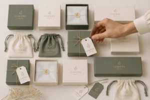
Modernization improves packaging design in specific areas. Sustainable materials replace wasteful alternatives without losing cultural symbolism. Digital printing captures traditional patterns at scale. Minimalist layouts make packaging design feel contemporary. Brand D uses silver packaging to communicate modernity and elegance for tech-savvy urban consumers. The silver provides a sleek backdrop for contemporary jewelry. Geometric patterns enhance the brand’s minimalist appeal. This restrained color and pattern strategy meets modern minimalist expectations while maintaining cultural identity.
Creating Packaging for Multicultural Audiences
Universal Design Principles with Cultural Nuance
Multicultural audiences require packaging design that transcends borders. Universal principles like clarity and functionality guide every design decision. Cultural nuance adds layers of meaning for specific communities. YIN Jewelry’s geometric triangle box uses clean shapes to achieve a modern minimalist look. The design symbolizes stability and harmony found in Oriental philosophy. This approach merges traditional cultural meaning with contemporary design expectations. The Glass Pyramid Jewelry Box draws on I.M. Pei’s Louvre design. It combines Eastern simplicity with Western modernity. The packaging design reinterprets cultural heritage through a globally recognizable architectural form.
Customization and Personalization Strategies
Customization strengthens cultural resonance in jewelry packaging. Consumers want packaging that reflects their personal values and cultural identity. Brands offer options for colors, symbols, and materials. This strategy builds emotional loyalty while honoring cultural elements.
Case Examples of Successful Cultural Packaging
Luxury Brands That Nailed Cultural Storytelling
Luxury brands demonstrate how packaging design can celebrate cultural identity. YIN elevates its packaging system to a cultural installation dimension. The brand shifts from selling jewelry to outputting aesthetic paradigms. This strategy redefines luxury narrative by anchoring humanistic value. The packaging design carries the brand’s story and values. It enhances the unboxing experience and builds emotional loyalty.
Minimalist designs rely on flawless material quality, subtle textures, and precise structural engineering. The absence of visual noise allows the tactile experience and the jewelry itself to convey true luxury, demanding higher manufacturing standards to execute properly.
Small Businesses Using Heritage as a Differentiator
Small businesses leverage cultural heritage to stand out. They use artisanal techniques that large competitors cannot replicate. Handcrafted details in jewelry packaging create authentic connections. These brands prove that cultural identity drives consumer loyalty. The design and presentation of their packaging reflects deep respect for tradition. This approach delivers cultural symbolism that resonates with discerning buyers.
Cultural traditions and cultural and social perceptions shape every aspect of jewelry packaging design. Successful packaging design evolves with cultural shifts while staying rooted in authentic tradition. Brands that balance cultural respect, modern functionality, and sustainability create packaging that resonates deeply with consumers. Informed design decisions empower businesses to build stronger connections, stand out in competitive markets, and honor the cultural stories behind their jewelry.
| Country | Projected CAGR (through 2035) | Cultural Tradition Drivers in Jewellery Packaging Design |
|---|---|---|
| India | 5.5% | Handmade wooden boxes and artisanal production |
| Japan | 4.6% | Lacquerware aesthetics and minimalist principles |
| China | 5.6% | Traditional gifting culture and elegant presentation |
| Global (wooden boxes) | 42% market share in 2025 | Craftsmanship appeal and heritage-driven purchasing |
FAQ
Why do cultural traditions matter in jewelry packaging?
Cultural traditions give emballage de bijoux meaning beyond simple protection. They connect products to heritage and values. Consumers recognize these elements instantly. Strong cultural identity builds trust and loyalty. Brands that honor traditions create packaging that resonates emotionally and stands out in competitive markets.
How does color choice reflect cultural identity in packaging design?
Color carries deep symbolic weight across cultures. Red signals prosperity in Chinese markets. White conveys purity in Western contexts. Each hue communicates specific values. Effective packaging design uses color to strengthen cultural identity and meet consumer expectations. The right palette makes packaging feel authentic and valuable.
What risks do brands face when they ignore cultural traditions?
Brands that ignore cultural traditions risk alienating consumers. They may use sacred symbols inappropriately. This damages cultural identity and brand reputation. Social media amplifies criticism quickly. Companies must research cultural meaning before finalizing any packaging design.
How can brands avoid cultural appropriation in jewelry packaging?
Brands should collaborate with cultural communities. They must obtain permission for sacred symbols. Fair compensation supports source artisans. This approach respects cultural identity and builds goodwill. Ethical packaging design requires ongoing dialogue and genuine respect for the communities behind each tradition.
Does sustainable packaging conflict with traditional aesthetics?
Sustainable materials often align with traditional values. Natural fibers support Japanese wabi-sabi aesthetics. Recycled paper carries Chinese patterns effectively. Biodegradable options honor indigenous respect for nature. Brands can protect cultural identity while meeting environmental goals. Modern consumers reward this balance with loyalty.
How do younger consumers influence cultural elements in packaging?
Younger consumers blend tradition with modernity. They want jewelry packaging that honors heritage while feeling fresh. Millennials and Gen Z value authenticity and sustainability. Brands respond with updated designs that preserve cultural identity. This shift drives innovation in packaging design across global markets.
Can global brands maintain cultural identity across different regions?
Global brands face tension between consistency and local relevance. Regional adaptation strengthens cultural identity in specific markets. Standardized packaging may feel generic to local consumers. Successful brands balance core elements with regional customization. This strategy builds trust and drives willingness to pay a premium.
What role does typography play in culturally resonant packaging?
Typography communicates cultural values before consumers read words. Calligraphy connects Eastern markets to tradition. Serif fonts signal European heritage. Sans-serif choices suggest American modernity. The right typeface strengthens cultural identity and makes packaging feel authentic to its target audience.
See Also
Ten Emerging Luxury Jewelry Packaging Design Trends For The Year 2026
Understanding Color Psychology Science When Selecting Jewelry Packaging Materials
Why Personalized Custom Jewelry Packaging Represents The Future Of Branding
Designing Effective Jewelry Packaging Specifically For Online Subscription Box Services
The Ultimate Strategy For Jewelry Gift Packaging During Busy Holiday Seasons