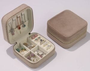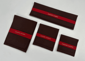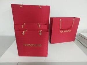

Η ψυχολογία των χρωμάτων διαδραματίζει καθοριστικό ρόλο στο συσκευασίες κοσμημάτων επιλογή, επηρεάζοντας άμεσα τον τρόπο με τον οποίο οι πελάτες αντιλαμβάνονται την αξία και την αποκλειστικότητα. Οι καταναλωτές συχνά συνδέουν τη μαύρη συσκευασία με την κορυφαία ποιότητα, ενώ η καφέ ή ανοιχτό πορτοκαλί συσκευασία υποδηλώνει χαμηλότερη αξία. Η οπτική παρουσίαση καθορίζει τις αποφάσεις αγοράς, με το χρώμα να αποτελεί πρωταρχικό παράγοντα για 87% αγοραστών, ιδίως εκείνοι ηλικίας 18 έως 34 ετών. Α κατασκευαστής συσκευασιών κοσμημάτων αναγνωρίζει ότι έθιμο κουτιά κοσμήματα, Οθόνη κοσμημάτων, και Θήκη για κοσμήματα Οι επιλογές επηρεάζουν την αντίληψη για το εμπορικό σήμα και τη μακροπρόθεσμη ανάμνηση.
Κατανόηση της ψυχολογίας των χρωμάτων στη συσκευασία κοσμημάτων
Ορισμός και αρχές της ψυχολογίας των χρωμάτων
Βασικές έννοιες της ψυχολογίας του χρώματος
Η ψυχολογία του χρώματος μελετά τον τρόπο με τον οποίο το χρώμα επηρεάζει την αντίληψη, τη συμπεριφορά και τη λήψη αποφάσεων. Στο πλαίσιο της συσκευασίας κοσμημάτων, το χρώμα λειτουργεί ως οπτική γλώσσα που μεταδίδει τις αξίες και την προσωπικότητα της μάρκας. Οι σχεδιαστές επιλέγουν χρώματα με σκοπό να προκαλέσουν συγκεκριμένες συναισθηματικές αντιδράσεις στους καταναλωτές.
- Τα χρώματα διαδραματίζουν καθοριστικό ρόλο στη δημιουργία της εταιρικής ταυτότητας και μπορεί να μεταδώσει την προσωπικότητα και τις αξίες μιας μάρκας.
- Το 85% των αγοραστών αναφέρουν το χρώμα ως τον κύριο λόγο για την αγορά ενός προϊόντος, υπογραμμίζοντας την επίδρασή του στη συμπεριφορά των καταναλωτών.
- Τα διαφορετικά χρώματα προκαλούν διαφορετικά συναισθήματα· για παράδειγμα, το βαθύ μπλε υποδηλώνει εμπιστοσύνη, ενώ το έντονο κόκκινο υποδηλώνει πάθος.
Η ψυχολογία του χρώματος αποκαλύπτει ότι κάθε απόχρωση φέρει μοναδικές συνειρμικές συνδέσεις. Η συνεπής χρήση του χρώματος σε όλη τη συσκευασία ενισχύει την αναγνωρισιμότητα και την αφοσίωση στο εμπορικό σήμα. Η επιλογή των σωστών χρωμάτων είναι ουσιαστικής σημασίας για τη δημιουργία συναισθηματικών δεσμών με τους καταναλωτές. Η κατανόηση των χρωματικών προτιμήσεων του κοινού-στόχου βελτιώνει την αποτελεσματικότητα του σχεδιασμού της συσκευασίας.
Πώς το χρώμα επηρεάζει τα συναισθήματα και τη συμπεριφορά των καταναλωτών
Το χρώμα και τα συναισθήματα είναι στενά συνδεδεμένα. Οι σχεδιαστές συσκευασιών κοσμημάτων χρησιμοποιούν την ψυχολογία των χρωμάτων για να προκαλέσουν συναισθηματικές αντιδράσεις στους καταναλωτές. Οι συναισθηματικές αντιδράσεις των καταναλωτών συχνά καθοδηγούν τις αποφάσεις αγοράς.
- Τα χρώματα και οι πολύτιμοι λίθοι μπορούν να επηρεάσουν σημαντικά τις συναισθηματικές καταστάσεις και τις αντιλήψεις.
- Κάθε χρώμα, όπως το κόκκινο που συμβολίζει το πάθος ή το μπλε που συμβολίζει την ηρεμία, έχει ψυχολογική βαρύτητα και πολιτισμική σημασία.
- Τα διαφορετικά χρώματα προκαλούν ξεχωριστές ψυχολογικές επιδράσεις στους θεατές.
- Η κατανόηση αυτών των επιδράσεων είναι ζωτικής σημασίας για τον σχεδιασμό βιτρινών κοσμημάτων που προκαλούν εντύπωση.
Ο ρόλος της ψυχολογίας των χρωμάτων στη λήψη αποφάσεων των καταναλωτών
Η επίδραση του χρώματος στις αποφάσεις αγοράς κοσμημάτων
Η ψυχολογία των χρωμάτων διαδραματίζει καθοριστικό ρόλο στο σχεδιασμό των συσκευασιών κοσμημάτων. Τα χρώματα έχουν τη δύναμη να προκαλούν συναισθήματα, να μεταδίδουν μηνύματα και να επηρεάζουν τη συμπεριφορά των καταναλωτών. Κατανοώντας τις ψυχολογικές επιδράσεις των διαφόρων χρωμάτων, οι σχεδιαστές κοσμημάτων δημιουργούν οπτικά ελκυστικές συσκευασίες που προσελκύουν τους πελάτες και ενισχύουν την αντιληπτή αξία των προϊόντων.
Ο ανθρώπινος νους δημιουργεί ισχυρούς συναισθηματικούς δεσμούς με συγκεκριμένους πολύτιμους λίθους, με αποτέλεσμα πολλές αποφάσεις αγοράς κοσμημάτων να υπερβαίνουν τα όρια της απλής αισθητικής. Για παράδειγμα, τα ρουμπίνια προκαλούν συναισθήματα πάθους και ζωντάνιας, ενώ τα ζαφείρια εμπνέουν εμπιστοσύνη και πίστη.
Η σημασία του χρώματος στο πλαίσιο της συσκευασίας κοσμημάτων
Η συσκευασία των κοσμημάτων πρέπει να συνάδει με την ταυτότητα της μάρκας και τις προσδοκίες των πελατών. Η σημασία των χρωμάτων διαφέρει από πολιτισμό σε πολιτισμό, επηρεάζοντας τις συναισθηματικές αντιδράσεις των καταναλωτών.
Σε διάφορους πολιτισμούς ανά τον κόσμο, τα χρώματα έχουν ξεχωριστές συμβολικές έννοιες που επηρεάζουν βαθιά το σχεδιασμό των κοσμημάτων και τις προτιμήσεις των καταναλωτών. Για παράδειγμα, το κόκκινο συμβολίζει την τύχη και την ευημερία στην κινεζική κουλτούρα, ενώ στις δυτικές κοινωνίες αντιπροσωπεύει το πάθος.
Οι σχεδιαστές συσκευασιών πρέπει να κατανοούν την ψυχολογία του χρώματος, ώστε να επιλέγουν αποχρώσεις που να βρίσκουν απήχηση στην αγορά-στόχο τους. Οι συνεπείς χρωματικές επιλογές ενισχύουν την αναγνωρισιμότητα της μάρκας και καλλιεργούν την αφοσίωση των πελατών. Η σωστή επιλογή χρωμάτων στις συσκευασίες κοσμημάτων δημιουργεί μια διαρκή εντύπωση και αυξάνει την πιθανότητα θετικών αποφάσεων αγοράς.
Ψυχολογικές επιδράσεις των συνηθισμένων χρωμάτων στις συσκευασίες κοσμημάτων

Το μαύρο στη συσκευασία κοσμημάτων
Συνδέσεις με την πολυτέλεια και την κομψότητα
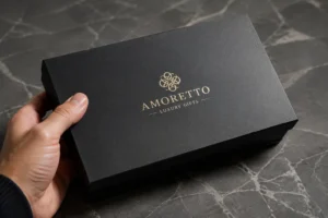
Το μαύρο αποτελεί κυρίαρχο χρώμα στις συσκευασίες κοσμημάτων και επιλέγεται συχνά από μάρκες που επιθυμούν να προβάλλουν μια εικόνα αποκλειστικότητας και κομψότητας. Το χρώμα αυτό συνδέεται άμεσα με τις μάρκες πολυτελείας υψηλού επιπέδου, καθώς εκφράζει συνδέσεις με τη δύναμη, την εξουσία και τη διαχρονική κομψότητα. Η μαύρη συσκευασία ενισχύει την οπτική ελκυστικότητα των κοσμημάτων, δημιουργώντας μια εντυπωσιακή αντίθεση που αναδεικνύει τα πολύτιμα μέταλλα και τους πολύτιμους λίθους. Αυτό το αποτέλεσμα εφιστά την προσοχή στο προϊόν και αναβαθμίζει την αντιληπτή αξία του. Οι καταναλωτές που εκτιμούν την ποιότητα και τη δεξιοτεχνία αντιδρούν θετικά στο μαύρο χρώμα, καθώς αυτό μεταδίδει μια αίσθηση αποκλειστικότητας και υψηλής λιανικής αξίας. Πολλές λύσεις συσκευασίας πολυτελείας βασίζονται στο μαύρο χρώμα για να δημιουργήσουν μια αξέχαστη εμπειρία αποσυσκευασίας που ανταποκρίνεται στις προσδοκίες των απαιτητικών αγοραστών.
Καταλληλότητα για μάρκες υψηλής ποιότητας και κλασικές μάρκες
Οι μάρκες κοσμημάτων υψηλής ποιότητας και κλασικού στυλ επιλέγουν συχνά το μαύρο για τις συσκευασίες τους, προκειμένου να ενισχύσουν την ταυτότητα της μάρκας τους. Αυτό το χρώμα εκφράζει κομψότητα και αξιοπιστία, καθιστώντας το ιδανικό για προϊόντα που απευθύνονται σε καταναλωτές που αναζητούν διαχρονική κομψότητα. Το μαύρο προσφέρει επίσης ένα ουδέτερο φόντο, επιτρέποντας στα κοσμήματα να γίνουν το επίκεντρο της προσοχής. Οι μάρκες που δίνουν έμφαση στην παράδοση και την κληρονομιά θεωρούν το μαύρο ιδιαίτερα αποτελεσματικό για την επικοινωνία των αξιών τους. Η χρήση του μαύρου στη συσκευασία ενισχύει μια συνεπή και αναγνωρίσιμη εικόνα της μάρκας, η οποία είναι απαραίτητη για την οικοδόμηση μακροπρόθεσμης αφοσίωσης των πελατών.
Το λευκό στη συσκευασία κοσμημάτων
Αντιλήψεις περί αγνότητας και απλότητας
Το λευκό παραμένει ένα δημοφιλές χρώμα στις συσκευασίες κοσμημάτων λόγω των ισχυρών συνειρμών που προκαλεί με καθαρότητα, κομψότητα και διαχρονικότητα. Πολλές μάρκες χρησιμοποιούν το λευκό για να μεταδώσουν μια αίσθηση καθαριότητας και απλότητας, η οποία βρίσκει απήχηση στους καταναλωτές σε σημαντικές περιστάσεις, όπως γάμοι και επετείους. Η μινιμαλιστική αισθητική του λευκού υποδηλώνει κομψότητα και συνάδει με τις αξίες των μάρκων υψηλής ποιότητας. Το λευκό λειτουργεί επίσης ως ουδέτερο φόντο, ενισχύοντας την οπτική γοητεία των κοσμημάτων και αναδεικνύοντας κάθε κομμάτι ξεχωριστά.
- Το λευκό συμβολίζει την αγνότητα, την κομψότητα και τη διαχρονικότητα, αξίες που εκτιμώνται ιδιαίτερα στον κόσμο των κοσμημάτων, ειδικά για σημαντικές περιστάσεις όπως γάμοι και επετείους.
- Η καθαρή, μινιμαλιστική αισθητική του λευκού εκφράζει κομψότητα, που συνάδει με τις μάρκες υψηλής ποιότητας.
- A neutral background enhances the visual appeal of the jewelry, making it stand out.
Appeal to Minimalist and Modern Jewelry Brands
Minimalist and modern jewelry brands frequently choose white for their packaging to reflect their design philosophy. White communicates clarity and openness, which appeals to consumers who prefer understated elegance. This color also supports a wide range of branding elements, allowing for flexibility in logo placement and accent colors. Brands that focus on contemporary styles benefit from white packaging, as it reinforces a fresh and innovative image. The simplicity of white ensures that the jewelry remains the centerpiece, attracting attention without distraction.
Gold in Jewelry Packaging
Symbolism of Wealth and Prestige
Gold holds a special place in jewelry packaging because it symbolizes wealth, heritage, and celebration. This color evokes feelings of prestige and high value, making it a preferred choice for premium products. The finish of gold—whether matte or glossy—can influence consumer perception. Matte gold conveys sophistication and controlled luxury, while gloss gold suggests showiness and extravagance. Modern luxury buyers often favor subtle refinement, so brands may choose matte gold to enhance emotional value and reflect the significance of the jewelry inside.
| Πτυχή | Περιγραφή |
|---|---|
| Symbolism of Gold | Represents wealth, heritage, and celebration. |
| Matte vs. Gloss | Matte gold conveys sophistication and controlled luxury, while gloss gold indicates showiness. |
| Consumer Preference | Modern luxury buyers favor subtle refinement over overt extravagance. |
| Emotional Value | Packaging must reflect the emotional significance of jewelry, with matte gold enhancing this. |
Effectiveness for Premium and Celebration Jewelry
Gold packaging proves highly effective for premium and celebration jewelry collections. Consumers associate gold with high quality, which increases the perceived value of the product. According to recent sales data, 73% of consumers agree that products in luxury packaging feel higher in quality. Visual appeal plays a significant role, with 48% of millennials willing to pay more for products with attractive packaging. Sustainability also matters, as 81% of jewelry buyers consider environmental factors in their purchases. Brands that use gold packaging can communicate both prestige and a commitment to quality, appealing to a broad range of customers.
- 73% of consumers agree that products in luxury packaging feel higher in quality, indicating the positive perception associated with premium packaging.
- 48% of millennials are willing to pay more for products with aesthetically pleasing packaging, showing the importance of visual appeal in attracting younger consumers.
- 81% of jewelry buyers consider sustainability in their purchases, highlighting the role of packaging in reflecting a brand’s environmental commitment.
Blue in Jewelry Packaging
Feelings of Trust and Calm
Blue stands out as a powerful color in jewelry packaging. Brands often select blue to evoke feelings of trust, loyalty, and calmness. The meaning of blue comes from both learned associations and deep cultural roots. People connect blue with natural cues such as the sky and water, which creates a sense of clarity and stability. This connection explains why blue appears in hospitals, tech interfaces, and financial institutions. Blue feels steady and reliable, not urgent or overwhelming.
- Blue conveys trust, loyalty, and calmness, making it ideal for reputable brands.
- Dark blues exude professionalism and reliability, while lighter blues feel fresh and inviting.
- Blue is commonly associated with clarity because it links to natural elements like the horizon and distance.
- Blue has always been tied to trust, stability, and luxury in cultural psychology.
Jewelry packaging designers use blue to create a calming and distinctive experience. The color blue achieves something remarkable: it feels trustworthy yet attention-grabbing. Customers respond positively to blue packaging because it signals quality and care.
Use for Professional and Reliable Jewelry Brands
Professional jewelry brands rely on blue packaging to enhance customer confidence. The color blue communicates sophistication and elegance, increasing the perceived value of the jewelry. Blue packaging signals attention to detail and quality, building trust before the product is even revealed. Customers view their purchase as a special investment when it arrives in elegant blue packaging.
| Evidence Description | Impact on Customer Confidence |
|---|---|
| The color blue conveys sophistication and elegance, increasing perceived value. | Enhances the perceived quality of the jewelry. |
| Blue packaging signals quality, care, and attention to detail. | Builds trust even before the product is revealed. |
| Customers perceive their purchase as a special investment in elegant blue packaging. | Increases the emotional value associated with the purchase. |
| Effective packaging safeguards the item and customer confidence in quality. | Reinforces brand reliability and commitment to quality. |
| A well-crafted unboxing experience can foster loyalty among customers. | Turns first-time buyers into repeat customers. |
| Blue packaging reflects a brand’s commitment to sustainability. | Appeals to eco-conscious consumers, enhancing brand image. |
A well-crafted unboxing experience in blue packaging fosters loyalty. First-time buyers often become repeat customers because the packaging reflects reliability and commitment to quality. Blue packaging also appeals to eco-conscious consumers, enhancing the brand image and supporting sustainability.
Red in Jewelry Packaging
Emotional Impact and Passion
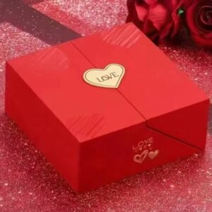
Red stands as one of the most emotionally charged colors in jewelry packaging. Brands use red to evoke passion, excitement, and energy. The color red draws attention and creates a sense of urgency. People associate red with love, romance, and boldness. Jewelry packaging in red often signals that the product inside is meant for special occasions or heartfelt moments.
Red packaging creates a strong visual impact. Customers feel a surge of emotion when they see red, which can influence their purchasing decisions. The color red also carries cultural significance. In Western societies, red represents passion and desire. In other cultures, red may symbolize luck and prosperity. Jewelry brands use red packaging to connect with customers on an emotional level.
Attraction for Romantic and Bold Jewelry Brands
Romantic and bold jewelry brands often select red packaging to stand out. The color red appeals to customers seeking dramatic and memorable pieces. Red packaging signals that the jewelry is unique and expressive. Brands targeting couples or individuals celebrating milestones use red to reinforce the emotional value of their products.
- Red packaging attracts attention and creates excitement.
- Romantic brands use red to highlight love and passion.
- Bold brands rely on red to signal confidence and individuality.
- Red packaging makes the unboxing experience memorable and meaningful.
Jewelry brands that want to connect with customers emotionally choose red packaging. The color helps create a lasting impression and encourages customers to associate the brand with passion and romance.
Green in Jewelry Packaging
Associations with Nature and Sustainability
Green has become a leading color in jewelry packaging, especially for brands focused on sustainability and wellness. Customers associate green with nature, growth, and environmental responsibility. The color green signals that the brand values simplicity and stewardship. Recent studies show that 66% of customers prefer products in green packaging, indicating a strong consumer preference for sustainability. Young adults, in particular, actively seek sustainable products, reflecting a generational shift toward eco-conscious purchasing.
- Green packaging enhances brand image, making it appear environmentally friendly.
- Consumers purchase not just the product but also its values, including sustainability and responsible stewardship.
- New materials like recycled papers and biomaterials redefine luxury packaging, aligning with consumer expectations for environmental responsibility.
The evolving standards of luxury in jewelry now emphasize simplicity and sustainability over traditional extravagance. Green packaging helps brands communicate these values and attract customers who prioritize environmental responsibility.
Suitability for Eco-Friendly and Wellness Jewelry Brands
Eco-friendly and wellness jewelry brands use green packaging to appeal to environmentally conscious consumers. Green packaging reduces waste and supports circular economies, which resonates with shoppers who care about the planet. Brands demonstrate their commitment to environmental values by using sustainable materials in their packaging. Intentional design in green packaging enhances brand loyalty by aligning with the principles of consumers who prioritize sustainability.
- Eco-friendly jewelry packaging reduces waste and supports circular economies.
- Sustainable materials in packaging demonstrate a brand’s commitment to environmental values.
- Intentional design in packaging enhances brand loyalty among eco-conscious consumers.
Green packaging stands as a symbol of responsible stewardship. Brands that use green packaging attract customers who value sustainability and wellness. The color green helps jewelry brands build trust and loyalty by aligning with consumer expectations for environmental responsibility.
Pink in Jewelry Packaging
Connotations of Femininity and Romance
Pink stands as a powerful color in jewelry packaging, often chosen to evoke feelings of romance, tenderness, and femininity. Brands select pink to create an emotional connection with customers, especially during occasions such as anniversaries or Valentine’s Day. Soft pink tones, like blush and rose quartz, communicate elegance and sophistication. These shades appeal to consumers seeking jewelry that represents affection and sentimental value. Pink packaging enhances the perceived delicacy of the jewelry, making the unboxing experience memorable and meaningful. Many brands use pink to reinforce their identity as providers of romantic and heartfelt gifts.
Pink packaging creates a sense of warmth and intimacy, making it ideal for jewelry collections that celebrate love and personal milestones.
Targeting Young and Trendy Jewelry Audiences
Jewelry brands targeting young and trendy audiences often rely on pink packaging to stand out in a competitive market. Demographic analysis reveals that muted pink tones broaden the appeal beyond traditional gender stereotypes. Brands use playful pink hues to engage Gen Z consumers, who value inclusivity and modern aesthetics. Soft pink conveys luxury and minimalism, attracting young buyers in high-end markets. In various cultures, pink symbolizes happiness and youth, enhancing its effectiveness in lifestyle branding.
| Characteristic | Περιγραφή |
|---|---|
| Gender-Neutral Shades | Muted tones like blush and rose quartz appeal to diverse gender identities, broadening the audience. |
| Luxury and Minimalism | Soft pink conveys elegance and sophistication, attracting young consumers in high-end markets. |
| Cultural Context | In various cultures, pink symbolizes happiness and youth, enhancing its appeal in lifestyle branding. |
| Strategic Positioning | Brands use pink playfully to engage Gen Z, moving beyond traditional gender stereotypes. |
Jewelry packaging in pink signals freshness and creativity. Brands that wish to connect with young, fashion-forward customers often choose pink to reflect current trends and cultural shifts. The color supports a brand’s effort to appear approachable and innovative.
Purple in Jewelry Packaging
Links to Creativity and Royalty
Purple has long been associated with luxury, creativity, and royalty in jewelry packaging. Brands select purple to communicate prestige and artistic flair. Deep purple tones feel regal and prestigious, while lighter lavender shades offer a gentle and soothing effect. Purple stands out as a color that signals uniqueness and innovation, making it ideal for brands seeking to differentiate themselves in the marketplace.
- Purple links to luxury, spirituality, and creativity.
- Deep purples feel regal and prestigious.
- Lavender tones feel gentle and soothing.
- Ideal for brands looking to stand out with a unique, artistic appeal.
- Purple represents royalty, luxury, and creativity, making it suitable for high-end and artistic products.
- Artisan and boutique brands use purple packaging to appear unique, creative, and regal.
- Historically, purple dye was rare, so the color became associated with nobility, luxury, mystery, and magic.
- Purple is the color of choice for jewelry that is exceptional or artisan-crafted, setting brands apart from mass-market competitors.
Appeal for Artistic and Unique Jewelry Brands
Artistic and unique jewelry brands find purple packaging especially appealing. This color symbolizes luxury, creativity, and mystery. Historically linked to nobility, purple helps brands distinguish themselves as exceptional and artisan-crafted. Deep plum shades create a regal unboxing experience, while lighter lavender tones cater to whimsical collections. Purple enhances the artistic appeal of jewelry, making each piece feel special and exclusive. Brands that prioritize creativity and individuality often select purple to reinforce their identity and attract customers seeking something extraordinary.
Purple packaging elevates the brand image, offering a sense of magic and exclusivity that resonates with collectors and connoisseurs.
Silver in Jewelry Packaging
Associations with Modernity and Elegance
Silver stands as a preferred color in jewelry packaging for brands that value modernity and elegance. High-end retailers utilize silver paper packaging to enhance brand perception and provide a premium customer experience. The reflective quality of silver foil boosts visual appeal, contributing to a sense of exclusivity and sophistication. Silver packaging often appears in luxury items such as jewelry, designer watches, and high-end cosmetics.
- High-end retailers use silver packaging to enhance brand perception.
- The reflective quality of silver foil increases visual appeal and exclusivity.
- Silver packaging is common for luxury jewelry, designer watches, and premium cosmetics.
Silver communicates a contemporary aesthetic, making it suitable for brands that wish to project innovation and style. The color supports a sleek and minimalist design, appealing to customers who appreciate modern elegance.
Suitability for Contemporary and Tech-Inspired Jewelry Brands
Contemporary and tech-inspired jewelry brands often select silver packaging to reinforce their identity. Silver signals progress and sophistication, aligning with the values of brands that focus on cutting-edge design and technology. The color integrates seamlessly with other packaging elements, such as geometric patterns or metallic accents. Silver packaging provides a neutral yet striking backdrop, allowing jewelry to shine and attract attention. Brands targeting urban and tech-savvy consumers benefit from silver’s association with modernity and high quality.
Silver packaging offers a futuristic touch, making it ideal for jewelry collections that emphasize innovation and contemporary style.
Brown in Jewelry Packaging
Connections to Earthiness and Authenticity
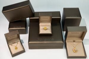
Brown stands as a grounding color in jewelry packaging. Many brands choose brown to evoke a sense of earthiness and authenticity. This color draws inspiration from natural materials such as wood, soil, and stone. Consumers often associate brown with honesty, reliability, and a connection to nature. The Pantone Color of the Year 2026, Mocha Mousse, highlights these qualities. This shade brings warmth and a natural aesthetic to packaging design, especially in jewelry branding. Shoppers who value authenticity respond positively to brown because it feels genuine and unpretentious.
Jewelry packaging in brown creates a tactile and visual link to the environment. Brands that use this color often want to communicate a story of craftsmanship and tradition. Brown also signals sustainability, which appeals to eco-conscious buyers. The color’s understated elegance allows the jewelry to shine without distraction. Many designers use brown to reinforce the message that their products come from natural origins and reflect honest workmanship.
Appeal for Rustic, Handmade, or Organic Jewelry Brands
Rustic, handmade, and organic jewelry brands often select brown packaging to align with their brand values. This color supports a narrative of simplicity and environmental responsibility. Brown packaging materials, such as cardboard, wood, or leather, enhance the perception of authenticity and quality. Customers seeking unique, handcrafted pieces often prefer packaging that feels as genuine as the jewelry inside.
The following table outlines common materials used in brown packaging and their benefits for rustic or organic brands:
| Τύπος υλικού | Benefits for Rustic/Organic Brands |
|---|---|
| Brown Cardboard / Paperboard | Lightweight, cost-effective, ideal for eco-conscious brands. |
| Wood (Solid or Engineered) | Premium appeal, natural beauty, aligns with organic aesthetics. |
| Leather & Faux Leather | Conveys luxury, cruelty-free options available, suitable for high-end jewelry. |
| Μέταλλο | Provides protection, modern or vintage aesthetic, suitable for luxury collections. |
| Βιώσιμες επιλογές | Prioritizing FSC-certified wood, recycled paperboard, or vegan leather appeals to eco-conscious consumers. |
Brands that prioritize sustainability often choose brown packaging made from recycled or certified materials. This approach resonates with buyers who care about the environment and want their purchases to reflect those values. Brown remains a versatile color that supports both rustic charm and modern eco-friendly messaging.
Orange in Jewelry Packaging
Energy, Warmth, and Creativity
Orange brings a burst of energy to jewelry packaging. This color radiates warmth and creativity, making it a favorite for brands that want to stand out. Orange draws attention without overwhelming the senses. It combines the cheerfulness of yellow with the boldness of red, resulting in a vibrant and inviting appearance. Many consumers associate orange with enthusiasm, optimism, and innovation.
Jewelry packaging in orange often signals a playful or adventurous spirit. Brands use this color to create excitement around new collections or limited-edition pieces. Orange also works well for brands that want to appear approachable and friendly. The color’s lively nature makes the unboxing experience memorable and engaging.
Tip: Orange packaging can help brands capture the attention of shoppers during festive seasons or special promotions.
Use for Fun, Youthful, or Seasonal Jewelry Collections
Fun and youthful jewelry brands frequently select orange packaging to connect with their target audience. This color appeals to younger consumers who seek bold and expressive designs. Orange packaging suggests creativity and spontaneity, which aligns with the values of trend-driven shoppers. Seasonal collections, such as summer or autumn releases, benefit from the warmth and vibrancy of orange.
Brands often use orange to highlight collaborations, pop-up events, or holiday-themed jewelry. The color’s versatility allows it to complement a wide range of styles, from bohemian to contemporary. Orange packaging creates a sense of anticipation and joy, encouraging customers to explore and celebrate each piece.
Jewelry brands that want to inject energy and creativity into their image find orange an effective choice. The color supports a dynamic brand identity and helps products stand out in a crowded marketplace.
Aligning Jewelry Packaging Colors with Brand Identity and Customer Expectations
Matching Color Psychology to Brand Values
Luxury and Exclusivity in Packaging Choices
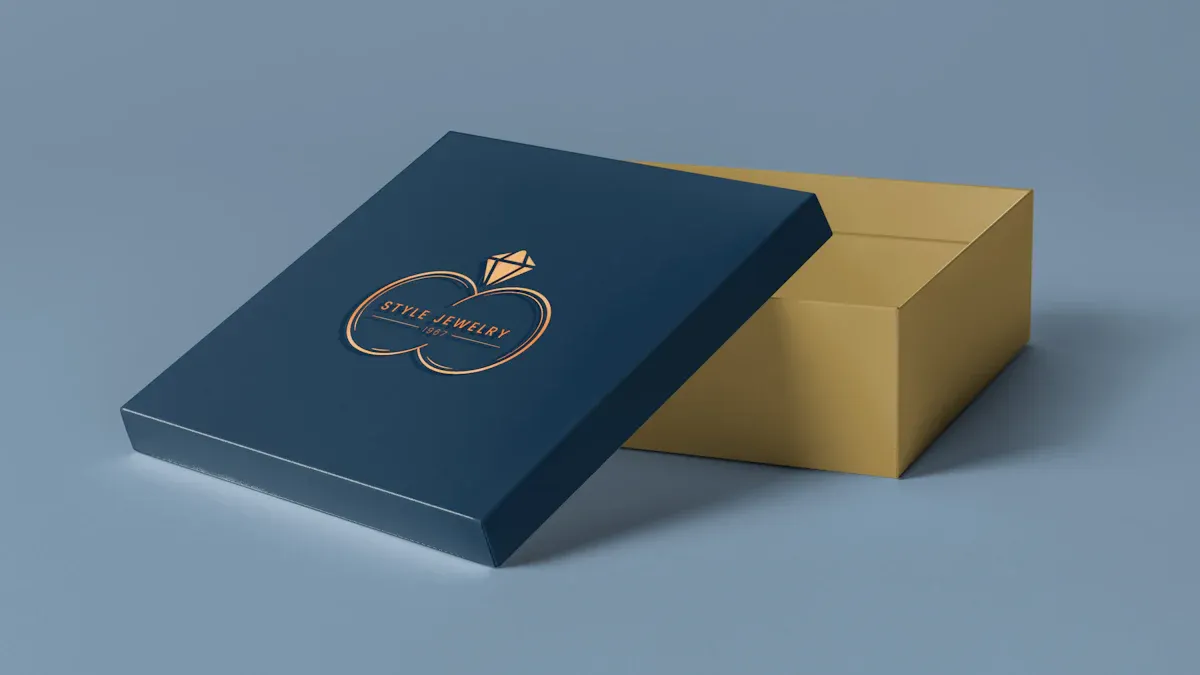
Jewelry brands seeking to convey luxury and exclusivity often rely on a strategic color choice. Black and gold dominate this space because they signal prestige and high value. These colors influence consumer perceptions, making the packaging feel more refined and desirable. When brands select colors that reflect their values, they create a strong emotional connection with customers. Packaging that uses black or gold transforms the unboxing experience into a memorable event, reinforcing the brand’s identity and elevating perceived worth.
Eco-Friendliness and Sustainability Messaging
Green has become the go-to color for brands committed to eco-friendliness. This color signals environmental responsibility and appeals to consumers who prioritize sustainability. Packaging in green or earth tones communicates a brand’s dedication to responsible practices. Brands that align their packaging colors with these values stand out in a crowded market. Selecting the right color choice can turn packaging into a marketing asset that builds trust and loyalty.
Romance and Sentiment in Color Selection
Romantic and sentimental jewelry brands often choose red, pink, or soft pastels. These colors evoke feelings of love, warmth, and affection. Packaging that features these hues appeals to customers shopping for special occasions or meaningful gifts. By matching colors to your target audience, brands can create an emotional bond that encourages repeat purchases and positive word-of-mouth.
Modernity and Innovation through Color
Brands that want to project modernity and innovation often select silver, white, or bold accent colors. These choices suggest forward-thinking design and contemporary style. Packaging in these colors appeals to tech-savvy and trend-conscious consumers. Aligning packaging colors with brand identity ensures that every detail supports the brand’s message and market position.
Understanding Customer Demographics and the Psychology of Color
Age and Gender Preferences in Jewelry Packaging
Different age groups and genders respond to color in unique ways. Younger consumers often prefer vibrant or unconventional colors, while older buyers gravitate toward classic tones. Gender also plays a role in color perception. For example, pink and soft hues attract a younger, more feminine audience, while neutral or bold colors appeal to a broader demographic. Matching colors to your target audience helps brands maximize appeal and relevance.
Cultural Influences on Color Perception and Selection
Color perception varies across cultures. Red may symbolize luck in one region and passion in another. Brands must research cultural meanings before finalizing their packaging color choice. This approach prevents misunderstandings and ensures that packaging resonates with local consumers.
Customizing Packaging Colors for Target Markets
Regional Color Trends in Jewelry Packaging
Regional trends influence color preferences. In some markets, blue and silver dominate, while others favor gold or green. Brands that monitor these trends can tailor their packaging to local tastes, increasing their competitive edge.
Seasonal and Occasion-Based Color Strategies
Seasonal events and holidays offer opportunities to refresh packaging colors. For example, red and gold work well for festive seasons, while pastels suit spring collections. Adapting color choice for special occasions keeps packaging relevant and engaging.
Note: A lack of effective color strategy can result in generic packaging that fails to connect emotionally with consumers. Strategic color choices reinforce brand identity and help brands stand out.
Case Studies: Real-World Applications of Color Psychology in Jewelry Packaging
Successful Jewelry Brands Leveraging Color Psychology
Brand A: Black and Gold for Luxury Appeal
Brand A uses black and gold in its jewelry packaging to create a sense of exclusivity. The combination of these colors signals luxury and sophistication. Customers associate black with elegance and gold with prestige. Brand A’s packaging stands out in retail displays, attracting buyers who seek high-value products. The brand’s strategy aligns with popular colors for bracelet packaging, especially for premium collections.
Brand B: Green for Eco-Conscious Positioning
Brand B adopts green as its primary packaging color. This choice communicates environmental responsibility and appeals to eco-conscious consumers. Green packaging reinforces the brand’s commitment to sustainability. Customers recognize the brand’s values immediately. Brand B’s approach resonates with shoppers who prioritize wellness and nature. The brand’s packaging also features recycled materials, strengthening its message.
Brand C: Pink for Youthful Engagement
Brand C selects pink for its jewelry packaging to target young and trendy audiences. Pink evokes feelings of romance and creativity. The brand uses playful shades to connect with Gen Z buyers. Pink packaging creates a memorable unboxing experience. Brand C’s strategy matches popular colors for bracelet packaging among younger demographics. The brand’s packaging design supports its identity as a provider of fresh and fashionable jewelry.
Brand D: Silver for Modern Minimalism
Brand D relies on silver for its packaging. Silver communicates modernity and elegance. The brand targets tech-savvy and urban consumers. Silver packaging provides a sleek backdrop for contemporary jewelry pieces. Customers perceive the brand as innovative and stylish. Brand D’s packaging integrates geometric patterns, enhancing its minimalist appeal.
Analysis of Outcomes from Strategic Color Choices
Customer Response and Sales Impact
Brands that leverage color psychology in jewelry packaging see measurable results. Brand A reports increased sales for luxury items after introducing black and gold packaging. Brand B receives positive feedback from eco-conscious buyers. Brand C observes higher engagement rates among young customers. Brand D notes improved customer retention due to its modern packaging design.
Note: Strategic color choices in packaging drive customer satisfaction and boost sales performance.
Brand Recognition and Loyalty Enhancement
Effective use of color in packaging strengthens brand recognition. Brand A’s black and gold packaging becomes synonymous with luxury. Brand B’s green packaging builds trust with environmentally aware shoppers. Brand C’s pink packaging fosters loyalty among young buyers. Brand D’s silver packaging enhances its reputation for innovation. Consistent color strategies help brands stand out and encourage repeat purchases.
| Μάρκα | Color Strategy | Outcome |
|---|---|---|
| A | Black & Gold | Increased luxury sales |
| B | Green | Positive eco feedback |
| C | Ροζ | Higher youth engagement |
| D | Silver | Improved retention & loyalty |
Practical Tips for Selecting Jewelry Packaging Colors Using Color Psychology
Steps for Choosing the Right Packaging Color
Define Brand Goals and Core Values
Every jewelry brand must start by clarifying its goals and core values before selecting packaging colors. The brand’s mission shapes the visual identity. For example, a company focused on luxury will choose colors that signal exclusivity. A brand committed to sustainability will select earth tones or green. The best bracelet packaging ideas often reflect the brand’s unique story. Clear goals help designers create packaging that resonates with customers and supports long-term recognition.
Research Target Audience Preferences and Expectations
Successful packaging strategies rely on understanding the target audience. Brands should analyze demographic data and consumer behavior. Age, gender, and cultural background influence color preferences. Surveys and market research reveal which colors attract specific groups. For gifting bracelets, brands must identify the best packaging color for gifting bracelets based on recipient expectations. Data-driven decisions ensure packaging appeals to the intended market and increases purchase likelihood.
Test Color Options and Gather Customer Feedback
Brands should test several color options before finalizing packaging designs. Prototypes allow companies to evaluate visual impact and emotional response. Customer feedback provides valuable insights. Focus groups and online polls help brands refine their choices. Testing ensures that packaging colors align with brand values and meet customer expectations. The best bracelet packaging ideas often emerge from iterative testing and direct input from buyers.
Common Mistakes in Applying the Psychology of Color
Overlooking Cultural Differences in Color Meaning
Many brands make the mistake of ignoring cultural differences in color interpretation. A color that symbolizes luck in one region may represent mourning in another. Global jewelry packaging strategies must account for these variations. Brands should research local customs and adapt packaging colors accordingly. Failure to do so can lead to misunderstandings and reduced appeal.
Ignoring Consistency Across Packaging Elements
Consistency strengthens brand identity. Some companies neglect to match colors across all packaging elements, including boxes, pouches, and display materials. Inconsistent color usage confuses customers and weakens recognition. Brands should establish guidelines to ensure uniformity. Consistent color choices reinforce the brand’s message and create a cohesive unboxing experience.
Balancing Aesthetics and Functionality in Jewelry Packaging
Ensuring Color Durability and Quality
Durability matters as much as aesthetics. Brands must select packaging materials that retain color vibrancy over time. Exposure to light, moisture, or handling can cause fading. High-quality materials preserve the intended color and protect the jewelry. Reliable packaging enhances customer satisfaction and supports repeat purchases.
Integrating Color with Other Packaging Design Elements
Color should complement other design elements, such as logos, textures, and finishes. Designers must consider how color interacts with metallic accents or embossing. The best packaging color for gifting bracelets often pairs well with ribbon or decorative features. A harmonious design elevates the perceived value of the jewelry and creates a memorable experience.
Tip: Brands that balance color psychology with practical design achieve stronger customer engagement and higher sales.
| Step | Action Item | Όφελος |
|---|---|---|
| Define Goals | Clarify brand mission and values | Guides color selection |
| Research Audience | Analyze demographics and preferences | Targets ideal customers |
| Test Colors | Gather feedback and refine options | Ensures market fit |
| Ensure Consistency | Match colors across all packaging elements | Builds brand recognition |
| Prioritize Quality | Use durable materials for lasting color | Enhances satisfaction |
| Integrate Design | Combine color with other design features | Creates memorable packaging |
Color psychology shapes how jewelry brands select packaging and influences customer perception. Successful businesses align packaging colors with brand identity and audience expectations.
- Packaging creates lasting impressions and drives purchasing decisions.
- Strategic color choices foster brand loyalty and recognition.
Jewelry businesses that apply color psychology in packaging design enhance customer engagement and achieve greater brand success.
ΣΥΧΝΈΣ ΕΡΩΤΉΣΕΙΣ
What is color psychology in jewelry packaging?
Color psychology studies how colors influence emotions and decisions. In jewelry packaging, brands use color to shape customer perceptions, highlight brand values, and drive purchasing behavior.
How does packaging color affect jewelry sales?
Packaging color impacts first impressions. Customers often associate certain colors with luxury, trust, or sustainability. Brands that choose the right color can increase perceived value and boost sales.
Which color works best for luxury jewelry packaging?
Black and gold remain top choices for luxury jewelry. These colors signal exclusivity, sophistication, and high value. Many premium brands use them to create a memorable unboxing experience.
Can color choices influence brand loyalty?
Yes. Consistent color use strengthens brand recognition. Customers remember brands that use distinctive colors. This recognition encourages repeat purchases and builds loyalty.
Should brands consider cultural differences in color meaning?
Absolutely. Colors carry different meanings in various cultures. For example, red means luck in China but passion in the West. Brands must research local preferences before finalizing packaging colors.
How can a brand test which packaging color works best?
Brands can create prototypes in different colors and gather customer feedback through surveys or focus groups. Testing helps identify which color resonates most with the target audience.
Does sustainable packaging color matter to eco-conscious buyers?
Yes. Eco-conscious buyers prefer green, brown, or earth tones. These colors signal environmental responsibility and align with sustainable brand values.