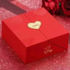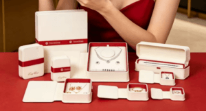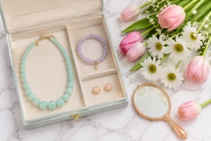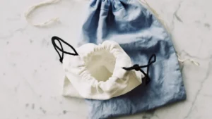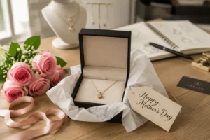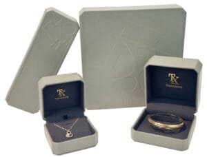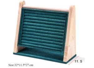
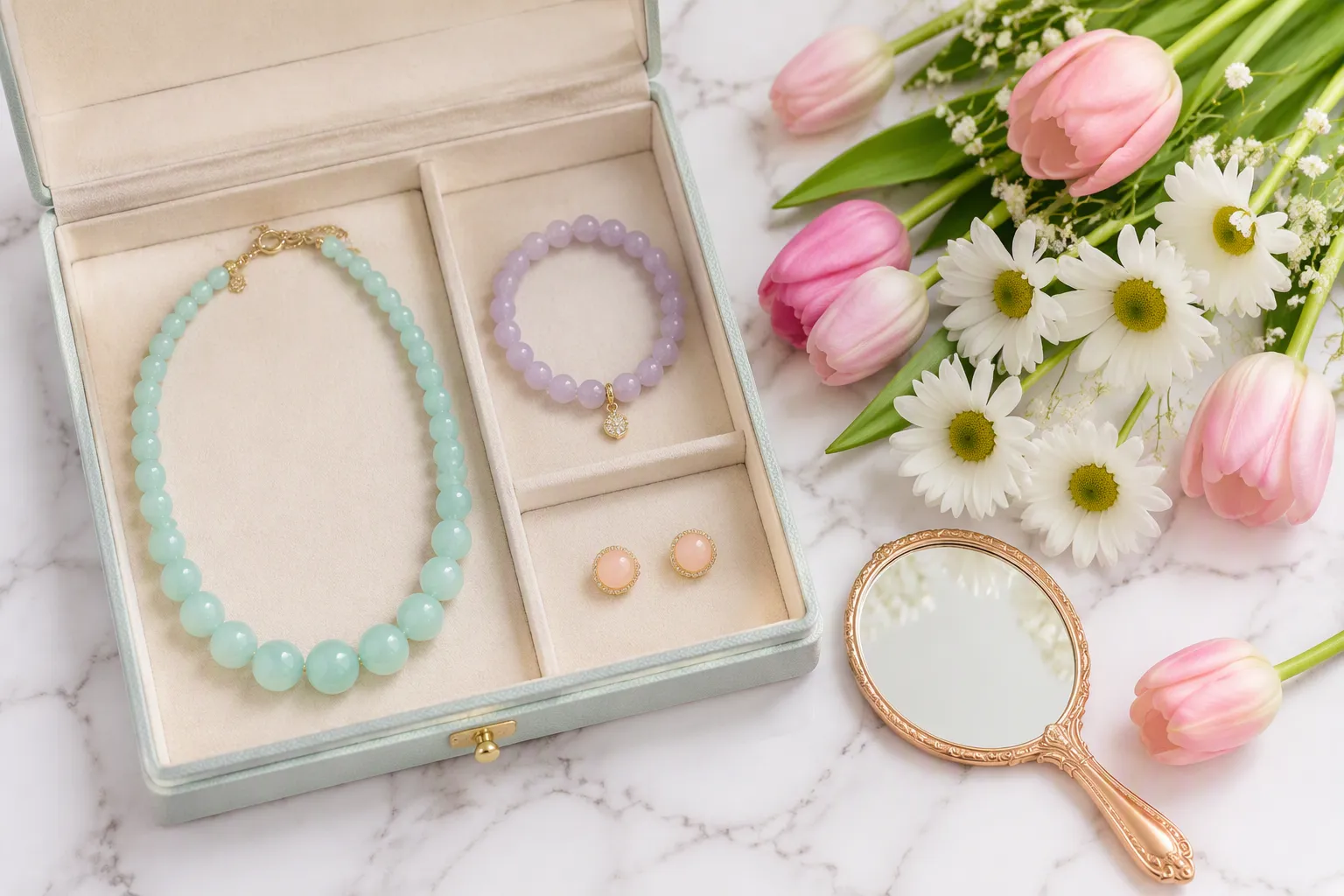
Soft hues like blush pink, mint green, and lavender capture the freshness of spring. Pastels work best when paired through complementary tones or monochromatic layering. A jewelry packaging manufacturer can extend these shades into custom jewelry boxes and every jewelry pouch for a unified presentation. This approach builds an emotional connection with customers. It emphasizes renewal, optimism, and gentle elegance. Pastel gemstones and thoughtful jewelry packaging complete the look, while a coordinated Jewelry Display reinforces the seasonal story.
Why Pastels Work for Spring
The Psychology of Pastel Colors
Emotional Response to Soft Hues
Pastels generate distinct emotional responses across different buyer groups. These soft pastel hues create specific reactions based on demographic factors:
- Age: Younger consumers gravitate toward pink and delicate tones. Older buyers prefer classic, subdued shades.
- Gender: Soft pink tones extend appeal across diverse gender identities. Muted shades like blush and rose quartz attract a broader audience.
- Cultural: In various cultures, pink symbolizes happiness and youth. This association enhances its relevance for lifestyle branding.
- Generational: Gen Z shoppers respond positively to playful pastel tones. These colors convey inclusivity and break traditional gender stereotypes.
Designers leverage these emotional connections to craft resonant pieces. Brands that understand these demographic nuances create more meaningful audience connections.
Pastels and the Feeling of Renewal
The spring season evokes renewal and fresh starts. Soft colors mirror this seasonal shift. Consumers link soft tones to optimism and growth. This psychological connection strengthens the relevance of pastel gemstones for spring merchandise. Designers choose pastel gemstones to capture this emotional resonance. These pieces feel timely and intentional.
Seasonal Trend Alignment with Spring Fashion
Fashion Runway Influence on Jewelry
Runway data confirms a decisive move toward softer tones. SS26 collections show pastel yellow rising from rank 29 to rank 4. Lavender moved from rank 26 to rank 13. Blush and mint green entered the top 30 for the first time. Paris Fashion Week coverage confirmed an explosion of color. Pale greys and soft tones stood out alongside brighter hues.
The whole pastel range, from pink to peach to mint green to pastel blue to lavender, makes a strong showing in the SS26 collections, but pastel yellow is the biggest “winner” in this year relative to past years, mostly in classically feminine and preppy contexts.
This runway influence directly shapes seasonal jewelry trends. Designers translate these colors into pastel pieces and delicate metalwork.
Consumer Buying Patterns in Spring
Shoppers refresh their wardrobes at the start of spring. They seek lighter colors and new looks. Pastel accessories offer an accessible entry point. Buyers purchase small items to test emerging trends. Retailers who align with seasonal shifts capture this spending surge. Strategic inventory planning maximizes revenue opportunities.
The Commercial Advantage of Pastels
Attracting New Customers with Fresh Displays
Visual merchandising with pastel hues draws attention in retail spaces. Fresh displays signal relevance and timeliness. New customers notice these bright yet gentle tones. A coordinated presentation communicates intentionality. This approach attracts buyers who might not normally engage with the brand.
Encouraging Repeat Purchases Through Seasonal Themes
Thematic collections build anticipation. Customers return to see what each season offers. Pastel themes create a sense of occasion. Consumers collect pieces across multiple cycles. This pattern sustains engagement and encourages loyalty. Seasonal rotations give shoppers a reason to revisit regularly.
Key Pastel Gemstones for Spring Jewelry
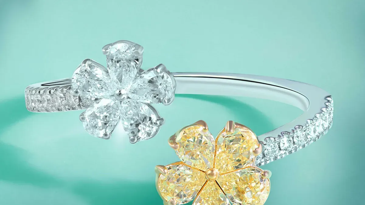
Popular Pastel Gemstones
Rose Quartz and Pink Opal
Rose quartz delivers a translucent blush tone that designers prize for romantic designs. This stone ranks among the most accessible pastel gemstones on the market. Its soft pink color flatters most skin tones. Jewelers set rose quartz in rings, pendants, and earrings with equal success. The stone’s gentle hue pairs well with rose gold and silver settings. Pink opal offers a more luminous alternative. This stone displays a milky background with subtle pink flashes. Pink opal carries a higher price point than rose quartz. Both stones represent perfect pastel gemstones for spring collections. Their warm tones evoke blossom season and gentle warmth.
Aquamarine and Blue Lace Agate
Aquamarine captures the essence of clear spring water. This stone ranges from pale blue to deeper ocean tones. Fashion houses have embraced aquamarine across recent collections.
| Fashion House | Aquamarine Usage | Season |
|---|---|---|
| Burberry | Aquamarine crochet dresses for summer days; aquamarine leather coats for breezy spring nights | Spring/Summer 2026 |
| Dior | Muted aquamarine dress resembling sea glass, made of tiny flowers | Spring/Summer 2026 |
| Prada | Aquamarine opera gloves as statement accessories | Spring/Summer 2026 |
| Emporio Armani | Aquamarine blouses with embroidered details; sheer sequin pants; matching skirt and top with beaded necklaces | Spring/Summer 2026 |
| Red carpet (Kate Hudson, Oscars 2026) | Strapless bejeweled aquamarine gown by Giorgio Armani Privé | 2026 awards season |
| Red carpet (Brie Larson, Super Mario premiere) | Deep aquamarine Rodarte silk crepe bias dress | 2026 |
March is associated with aquamarine as its birthstone, which implies increased demand for aquamarine jewelry and products during the spring month of March.
These pastel gemstones that embody its beauty attract buyers who seek cool, calming tones. Blue lace agate provides a softer alternative. This stone features delicate banding in pale blue and white. Its intricate patterns make each piece unique.
Amethyst and Lavender Jade
Amethyst offers a range of purple tones from pale lilac to deep violet. Light amethyst varieties work best for pastel collections. This stone remains affordable and widely available. Jewelers value amethyst for its durability and versatility. Lavender jade provides a more exotic option. This stone comes primarily from Guatemala and Burma. Its subtle purple-green undertones create visual depth. Lavender jade carries cultural significance in Asian markets. Both stones appeal to buyers who want distinctive pastel gemstones.
Green Amethyst and Prehnite
Green amethyst, also called prasiolite, displays a pale mint to sage green. This stone results from heat treatment of amethyst. Its fresh color suits spring and summer designs. Prehnite offers a similar green tone with a softer, milky appearance. This stone often contains dark inclusions that add character. Prehnite ranks among the more affordable pastel gemstones. Both options provide earthy alternatives to blue and pink stones. Designers use these greens to balance warmer pastel tones in multi-stone pieces.
Pastel-Friendly Metals and Finishes
Rose Gold and Yellow Gold
Rose gold complements pink and peach gemstones with exceptional warmth. This metal contains copper, which creates its distinctive blush tone. Rose gold settings enhance the romantic quality of pastel gemstones. Yellow gold provides a classic backdrop for green and blue stones. Its bright tone creates contrast without overwhelming delicate colors. Both metals resist tarnishing and maintain their appearance over time. Jewelers often choose these warm metals for vintage-inspired designs. The combination of warm metal and soft stone creates visual harmony.
Brushed Silver and Matte Finishes
Brushed silver offers a modern alternative to polished finishes. This treatment creates a soft, satin appearance. The muted surface allows pastel gemstones to stand out. Matte finishes reduce glare and create a contemporary aesthetic. These finishes suit minimalist designs and everyday wear. Jewelers achieve matte effects through sandblasting or chemical treatment. The resulting texture adds visual interest without competing with stone color. This approach works well for gemstone jewelry aimed at younger buyers.
Enamel and Resin Accents
Enamel coatings add color to metal surfaces. Jewelers apply enamel in thin layers and fire it at high temperatures. This technique creates durable, vibrant finishes. Pastel enamel complements stones in the same color family. Resin offers a lighter, more affordable alternative. This material allows for complex shapes and bold designs. Both enamel and resin expand design possibilities beyond traditional metalwork. These accents help create cohesive pastel color stories across a collection.
Organic and Alternative Materials
Mother-of-Pearl and Shell
Mother-of-pearl displays natural iridescence in soft pinks, greens, and iridescent hues. This material comes from the inner lining of mollusk shells. Each piece shows unique patterns and color variations. Jewelers cut mother-of-pearl into cabochons, inlays, and beads. The material adds organic beauty to pastel designs. Shell offers similar properties at a lower cost. Both materials suit casual and formal designs. Their natural origin appeals to environmentally conscious consumers.
Pastel Leather and Suede Elements
Leather and suede bring texture to pastel jewelry designs. Artisans dye these materials in soft colors to match stone tones. Leather cords provide comfortable, adjustable options for necklaces and bracelets. Suede tassels and wraps add movement and softness. These materials work well for bohemian and casual styles. They offer an alternative to metal chains and settings. Pastel leather and suede elements extend color themes throughout a collection.
Glass and Lucite Components
Glass offers endless color possibilities at accessible prices. Artisans create glass beads and cabochons in any pastel shade. Dichroic glass adds shimmer and color shifts. Lucite, a type of acrylic, provides lightweight durability. This material allows for bold shapes and transparent effects. Both glass and Lucite suit fashion-forward designs. They appeal to buyers who want statement pieces without high costs. These materials help brands test new pastel color combinations.
Color Pairing Strategies for Pastel Jewelry
Complementary Pastel Combinations
Blush Pink with Mint Green
Blush pink and mint green create one of the most recognizable spring pastel color pairings. This combination draws from garden blooms and fresh foliage. Jewelry designers use blush pink gemstones alongside mint green accents to balance warmth and coolness. A rose quartz pendant on a mint green cord illustrates this approach. The contrast feels lively without overwhelming the eye.
Lavender with Soft Peach
Lavender and soft peach offer a gentler contrast. These pastel hues sit close on the color wheel. This proximity creates visual harmony rather than tension. Jewelers pair light amethyst with peach moonstone or coral. The result feels romantic and sophisticated. This pairing suits bridal collections and spring gift sets.
Baby Blue with Cream
Baby blue and cream deliver a classic, airy combination. Aquamarine or blue lace agate set against cream enamel creates a clean aesthetic. This pairing works across casual and formal designs. The neutral cream softens the blue tone. Buyers perceive this combination as fresh and approachable.
Monochromatic Layering
Tonal Variations Within One Color Family
Monochromatic layering builds depth through a single color family. Designers select pastel gemstones in light, medium, and deep tones of the same hue. A necklace might feature pale pink opal, medium rose quartz, and deeper rhodonite. This technique creates cohesion across an entire jewelry collection.
Creating Depth with Light and Medium Shades
Light and medium shades within pastel color palettes generate visual interest. The lighter tone catches light and draws attention. The medium shade provides grounding and definition. Jewelers apply this principle to stacked rings, layered necklaces, and bracelets. Each piece remains distinct while contributing to a unified pastel colorway.
Neutral Grounding Techniques
Pairing Pastels with White and Ivory
White and ivory serve as reliable anchors for pastel jewelry. These neutrals prevent soft colors from appearing washed out. A white gold setting enhances the brightness of pastel blues, pinks, and greens. Ivory leather cords add warmth to cool-toned stones. This technique keeps pastel pieces wearable across seasons.
Using Gray and Taupe as Anchors
Gray and taupe offer sophisticated alternatives to white. These muted neutrals add maturity to pastel designs. Brushed silver and matte finishes complement gray tones effectively. Taupe suede elements pair well with lavender and peach stones. Designers use these anchors to create pastel jewelry that appeals to professional buyers. The spring collection gains versatility through this grounded approach.
Accent Color Approaches
Adding Metallic Touches for Contrast
Metallic accents provide essential structure for soft jewelry collections. Designers apply the “1 Color Pop + 2 Metal Anchors” rule to create intentional compositions. Without metallic anchors, stacks appear random and lack cohesion. With them, every piece feels elevated and deliberate.
Textures play a critical role in this approach. Brushed silver, hammered gold, and polished rose gold each create different interactions with soft gemstones. The texture-first logic helps every piece feel more expensive than its price tag. A simple rose quartz pendant gains sophistication when paired with a textured rose gold chain. A mint green bracelet with hammered silver accents reads as artisanal and refined. The contrast between matte metal and polished stone creates visual depth.
The 70/30 mixed-metal rule ensures smooth transitions between different tones. Designers use 70 percent of one metal and 30 percent of another. This deliberate ratio boosts coherence and conveys luxury. A combination of yellow gold and rose gold creates warmth without competing with delicate stones. Silver provides a cooler anchor for blue and green gemstones. Gold warms pink and peach tones effectively. Mixed metal designs prevent monotony and add complexity to each piece.
No metal anchor represents a common mistake. Stacks without metallic structure appear lower quality. The soft colors need the contrast of metal to read as intentional. A single metal element transforms a collection of random tones into a coordinated design. Even a subtle metallic connector or clasp lifts the entire composition.
Incorporating Deeper Jewel Tones Sparingly
Deeper jewel tones add drama to soft pieces without overwhelming the gentle character. A single emerald accent within a mint green necklace creates visual pop. Lapis lazuli elements against baby blue stones add depth without shifting the overall tone. Amethyst accents alongside lavender designs maintain the purple family while introducing contrast. These deeper stones create anchor points within the design.
The key lies in moderation. One deeper stone per piece or one accent element per collection maintains the soft character. Too many deep tones shift the aesthetic from airy to heavy. A lavender necklace with one small amethyst accent reads as sophisticated. The same piece with multiple deep stones loses its spring freshness and becomes weighty. The ratio of light to deep stones determines the overall feel.
Designers place these deeper accents strategically. A deep garnet bead at the closure of a blush pink bracelet draws the eye downward. A dark sapphire centerpiece in a baby blue pendant creates a focal point. Citrine accents in peach-colored designs add golden warmth. These placements guide the viewer’s attention through the piece and reward closer inspection.
The combination of metallic anchors and sparing deep tones creates the most compelling designs. The structure comes from metal. The drama comes from deeper stones. The spring collection gains excitement without sacrificing its gentle character. Pastel remains the star. Accents simply support the story.
Spring Jewelry Packaging Ideas for Cohesive Collections
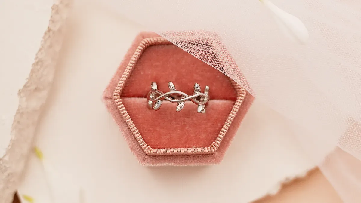
Choosing Pastel Jewelry Boxes
Matching Box Color to Jewelry Tone
The box color must echo the jewelry inside. A blush pink box suits rose quartz and pink opal pieces. A mint green box complements green amethyst and prehnite. A lavender box pairs well with amethyst and lavender jade. This matching approach creates instant visual harmony. Customers see the connection before they open the box.
Color-coordinated packaging increases customer engagement by up to 21% on social media (Pantone Institute, 2024).
Color-coordinated packaging increases customer engagement by up to 21% on social media (Pantone Institute, 2024).
Retailers report that consumers share photos of beautiful packaging online. This organic promotion extends brand reach without additional cost. The box becomes a marketing asset. A well-chosen box color transforms a simple purchase into a shareable moment.
Popular pastel box colors that drive social media sharing include:
- Blush pink
- Lavender
- Mint green
- Sky blue
- Ivory
- Sage
A second palette focuses on warmer, earthier tones:
- Blush pink
- Mint green
- Lavender
- Sage
- Soft ivory
These colors consistently perform well across demographic groups. Brands that adopt these shades see higher engagement rates. The packaging becomes part of the product experience.
Textured and Embossed Box Options
Texture adds tactile appeal to pastel boxes. A smooth matte finish feels modern and understated. A soft-touch coating invites customers to hold the box longer. Embossed patterns create visual interest without adding color. A subtle floral emboss for spring designs reinforces the seasonal theme.
Linen-textured paper offers a natural, organic feel. This option suits eco-friendly jewelry packaging strategies. Recycled cardboard with a pastel coating balances sustainability and aesthetics. Brands that prioritize environmental responsibility attract conscious consumers. The texture communicates quality before the box opens.
Embossing techniques include blind embossing and registered embossing. Blind embossing creates a raised design without ink. Registered embossing aligns the texture with printed elements. Both methods add perceived value to the packaging. A simple logo embossed on a pastel lid feels luxurious and intentional.
Ribbons, Tags, and Tissue Paper
Coordinating Ribbon Selections
Ribbons tie the packaging presentation together. Satin ribbons offer a smooth, lustrous finish. Grosgrain ribbons provide a matte, textured alternative. Organza ribbons add sheer elegance for delicate pieces. The ribbon color should match or complement the box shade.
A blush pink box with a mint green ribbon creates a fresh contrast. A lavender box with an ivory ribbon feels soft and romantic. A mint green box with a sage ribbon offers tonal harmony. These combinations reinforce the pastel colorways throughout the collection.
Ribbon width affects the overall impression. Narrow ribbons suggest delicacy and refinement. Wider ribbons make a bolder statement. Double-faced satin ribbons prevent color variation on the underside. This detail matters when customers photograph the packaging from multiple angles.
Custom Tags with Pastel Branding
Tags provide essential brand information and enhance the aesthetic. Spring-themed custom hang tags feature soft colors and seasonal motifs. A tag with a pressed flower design reinforces the spring narrative. A tag with a simple logo in pastel ink maintains brand consistency.
Tag shapes vary from traditional rectangles to circles and scalloped edges. Die-cut tags create distinctive silhouettes. A tag shaped like a leaf or blossom adds thematic relevance. The tag material should match the box quality. Heavy cardstock feels premium. Lightweight paper feels disposable.
Brands print care instructions on the reverse side. This practical information adds value to the tag. A QR code links to styling suggestions or care guides. The tag becomes a functional keepsake rather than disposable packaging.
Tissue Paper and Filler Choices
Tissue paper provides the first layer of discovery. Acid-free tissue paper protects delicate metals and stones. Custom-printed tissue paper extends branding into the box interior. A subtle pattern in pastel tones creates visual interest. The tissue color should complement the box and ribbon.
Crinkle cut paper offers a textured bed for jewelry pieces. This filler cushions items during shipping. Shredded paper provides similar protection with a more rustic appearance. Honeycomb paper wraps create a modern, eco-friendly presentation. These options appeal to environmentally conscious buyers.
Filler choices affect the unboxing experience. A jewelry pouch nestled in tissue paper feels protected and precious. A box with minimal filler feels sparse. The right balance of protection and presentation matters. Brands test different filler combinations to find the optimal unboxing sequence.
Creative Packaging Techniques
Upcycling and Decorating Pastel Boxes
Upcycling transforms packaging into a lasting item. Customers reuse decorated boxes for storage or display. This extended life reduces waste and keeps the brand visible. A well-made pastel box becomes a jewelry holder on a vanity. The brand remains part of the customer’s daily routine.
Decoration techniques include hand-painting and stamping. Artisans apply small floral motifs to box lids. Stamps create repeating patterns with consistent quality. These handcrafted touches justify higher price points. Customers perceive greater value in unique packaging.
Workshops teach customers to decorate their own boxes. This interactive experience builds community and loyalty. Participants share their creations on social media. The brand gains user-generated content and organic reach. Upcycling events position the brand as creative and environmentally responsible.
Stenciling and Decoupage for Personalization
Stenciling applies patterns to box surfaces with precision. A stencil with a leaf or petal design creates a spring motif. Metallic stencil paint adds contrast against pastel backgrounds. The technique works on cardboard, wood, and rigid box materials. Brands offer stenciling kits as add-on purchases.
Decoupage involves adhering paper cutouts to surfaces. Vintage botanical prints suit spring jewelry packaging ideas. Customers select images that match their personal style. A layer of sealant protects the design and adds durability. The finished box becomes a personalized keepsake.
Personalization extends to monograms and names. A stenciled initial on a pastel box lid creates a custom gift. Decoupage with birth month flowers adds sentimental value. These techniques transform standard packaging into memorable gifts. The recipient feels special and valued.
Brands offer personalization services at point of purchase. Customers choose stencil patterns or decoupage images. The completed box arrives ready for gifting. This service differentiates the brand from competitors. It also increases average transaction value through customization fees.
Display Strategies for Retail
Creating Pastel-Themed Display Tables
Retail displays with soft themes create visual harmony across a collection. A table draped in blush or mint fabric immediately signals the season. Display props like dried flowers, ceramic vessels, and natural wood elements reinforce the organic feel. Tall vases with blossoming branches add vertical interest. Small pedestals lift featured pieces to eye level. Light-toned risers create depth within the table layout.
Packaging plays a central role in these displays. Open boxes showcasing pastel-toned packaging invite customers to touch and examine items. Coordinated packaging reinforces the seasonal palette without requiring additional props. Retailers arrange packaging alongside the jewelry to create a complete visual story. A stack of spring jewelry packaging in matching hues serves as both display element and inventory. Eco-friendly jewelry packaging appeals to environmentally conscious shoppers and complements the natural theme. Spring gift packaging arrangements encourage multiple-item purchases and increase average transaction value.
Signage should match the soft theme. Printed cards in mint or lavender provide pricing and material information. Small easels hold these cards at a readable angle. The signage text uses clean, simple fonts. Brand logos appear in subtle tones rather than bold contrasts. This approach maintains the gentle aesthetic of the display.
Grouping by color family creates an organized presentation. A section devoted to blush and rose quartz pieces sits beside a mint green section. This arrangement allows customers to compare similar tones. It also encourages purchase of multiple pieces within the same color story. The table becomes a curated collection rather than a random assortment.
Props require thoughtful selection. Fresh flowers add life but require daily maintenance. Dried flowers last longer and maintain their color. Faux blooms offer consistent quality without wilting. Each option carries different cost and labor implications. Retailers choose based on their team capacity and desired aesthetic.
Lighting Considerations for Pastel Products
Lighting dramatically affects how customers perceive soft hues. Warm lighting enhances pink and peach tones. Cool lighting makes blue and green tones appear more vibrant. The wrong lighting washes out subtle differences between similar shades.
LED lights with adjustable color temperature offer the most flexibility. Retailers set a warm temperature around 2700K for displays featuring rose gold and blush tones. A cooler temperature around 4000K suits aquamarine and lavender pieces. Track lighting with separate zones allows different settings for different sections.
Spotlights create dramatic highlights on featured pieces. A focused beam draws attention to a single item. This technique works well for hero products or new arrivals. The spotlight should not create harsh shadows, especially on light surfaces. Diffusion filters soften the beam and prevent glare.
Overhead lighting must not cast shadows on display tables. A shadow obscures product details and diminishes the visual appeal. Multiple light sources from different angles eliminate unwanted shadows. Cross-lighting from two directions provides even coverage.
Glass display cases require special consideration. The glass itself reflects light and creates hot spots. Anti-glare glass reduces this effect. Lighting inside the case should sit above eye level. This position prevents the light source from blinding customers while they examine items.
The packaging benefits from the same lighting strategy. Well-lit packaging photographs better for social media sharing. Customers who photograph their purchases often include the box in their shots. Proper lighting ensures the packaging looks as appealing in user-generated content as it does in professional images.
Testing lighting before final installation prevents costly adjustments. Retailers set up a single display and photograph it under different lighting conditions. They evaluate the results in-store and on-screen. This process identifies problematic shadows or color shifts. Adjustments occur before the full rollout.
Curating a Cohesive Spring Collection
Unifying Jewelry and Packaging
Developing a Seasonal Color Story
A seasonal color story connects every piece in a springtime jewelry collections lineup. Designers select a palette that reflects the mood of the season. Blush pink, mint green, lavender, and soft ivory form a classic spring foundation. This palette extends from gemstones to metals to packaging. Each element reinforces the others. The result feels intentional rather than scattered.
Maintaining Brand Consistency Across Pastels
Brand consistency requires discipline across every touchpoint. A jewelry collection with pastel tones must carry those same shades into its packaging. The box color, ribbon, and tissue paper should echo the stones inside. This repetition builds recognition. Customers associate specific hues with the brand. That association strengthens trust over time.
Selecting a Focused Pastel Palette
Limiting to Three or Four Core Shades
A focused palette prevents visual chaos. Successful brands limit their spring palette to three or four core shades. Blush pink, mint green, lavender, and sage offer enough variety without overwhelming the eye. This restraint simplifies production and merchandising. It also makes the collection easier for customers to understand.
Building Flexibility with Accent Colors
Accent colors add flexibility within a tight palette. A deeper jewel tone or a metallic finish provides contrast. Designers use these accents sparingly. One amethyst bead in a lavender necklace creates interest. The accent supports the seasonal pastel colorway without dominating it. This approach keeps the collection fresh while maintaining cohesion.
Merchandising for Maximum Impact
Grouping by Color Family
Grouping by color family simplifies the shopping experience. Retailers arrange blush and rose quartz pieces together. Mint green and prehnite items sit in a separate section. This organization allows customers to compare similar tones. It also encourages multiple purchases within one color story.
| Brand | Best Practice | AOV / Conversion Impact |
|---|---|---|
| Missoma | Collection pages display full stacks and curated combinations; merchandising designed to encourage layering; seasonal capsules and collaborations | Selling full looks instead of single items consistently lifts AOV; styling-led merchandising naturally drives 2–3 items per order |
| Monica Vinader | Personalization (engraving) integrated into a premium shopping flow with real-time previews; curated gifting pathways and boxed sets | High-quality previews reduce uncertainty and finalize personalized orders; curated gifting structures drive stronger peak-season performance |
Creating Gift Sets and Bundles
Gift sets and bundles increase average order value. Matching earrings and pendant sets simplify buying decisions. Ring stacking combinations encourage customers to purchase multiple pieces. Seasonal limited-edition packaging creates urgency during peak gifting windows. Spring-specific designs like cherry blossom prints or butterfly motifs signal a time-sensitive offering. Retailers source small runs of seasonal packaging alongside core stock. This strategy lifts revenue during Mother’s Day, graduation, and spring wedding seasons. Layered and stackable pieces further support this goal. Thin gemstone bands, adjustable chain necklaces, and dainty charm bracelets invite customers to build their own combinations. A balanced mix of trend pieces and core staples ensures both quick seasonal sales and long-term reorder potential. Eco-friendly jewelry packaging and thoughtful spring jewelry packaging complete the presentation. These details transform a simple purchase into a memorable gift.
Seasonal Transitions and Inventory Planning
Moving from Spring Pastels to Summer Brights
Retailers must plan the shift from soft tones to vivid hues well before the season changes. A gradual transition keeps customers engaged without abrupt inventory gaps. Smart merchandising moves pastel pieces to clearance sections as summer approaches. This strategy frees shelf space for brighter options. The packaging for remaining spring items should still look fresh and appealing. Retailers often bundle slow-moving pastel pieces with summer accessories to accelerate sell-through. This approach clears old stock while introducing new arrivals. A well-timed transition protects profit margins and maintains customer interest.
Planning Pastel Restocks Based on Sell-Through
Sell-through data guides every restocking decision. Retailers track which shades sell fastest and which linger on shelves. A simple formula helps determine reorder quantities: sell-through rate = units sold / units received. High-performing colors warrant immediate reorders. Slow movers require markdowns or bundling strategies. The table below outlines common sell-through scenarios and recommended actions.
| Sell-Through Rate | Action | Timeline |
|---|---|---|
| Above 80% | Reorder immediately | Within 1 week |
| 50-80% | Moderate restock | Within 2-3 weeks |
| Below 50% | Markdown or bundle | Within 4 weeks |
Packaging decisions follow the same data-driven logic. Retailers order packaging in quantities that match projected sales. Overordering packaging ties up capital and creates waste. Underordering risks stockouts during peak demand. A balanced approach uses historical data from previous spring seasons. Brands that track packaging usage alongside jewelry sales achieve better inventory accuracy. This discipline reduces excess costs and improves cash flow. Consistent monitoring throughout the season ensures agility. Retailers who adjust quickly capture more sales opportunities.
Pastels connect spring shoppers with freshness and gentle elegance. Selecting the right pastel gemstones creates a memorable customer experience. Extending these tones into packaging drives sales. A unified approach coordinates jewelry and presentation. This strategy builds brand trust and encourages repeat purchases. Retailers refresh inventory with pastel accents. They incorporate spring jewelry packaging ideas. This captures the season’s spirit and maximizes revenue.
FAQ
Which pastel gemstones work best for spring jewelry?
Rose quartz, aquamarine, amethyst, and green amethyst rank among the top choices. These stones offer soft colors that reflect the season. Jewelers also use pink opal, blue lace agate, lavender jade, and prehnite. Each stone provides a distinct pastel tone for spring designs.
How do designers pair pastel colors effectively?
Designers combine complementary tones like blush pink with mint green. They also layer light, medium, and deep shades within one color family. Neutral anchors such as white, ivory, gray, and taupe prevent pastels from looking washed out. Metallic accents add structure and contrast.
What metals complement pastel gemstones?
Rose gold and yellow gold warm up pink and peach stones. Brushed silver and matte finishes suit blue and green gemstones. Enamel and resin accents extend color themes across a collection. The right metal choice enhances the stone without overpowering it.
How does packaging reinforce a pastel jewelry collection?
Packaging extends the color story beyond the jewelry itself. A blush pink box suits rose quartz pieces. A mint green box complements green amethyst. Coordinated ribbons, tags, and tissue paper create a unified presentation. This consistency builds brand recognition and encourages social media sharing.
Why do pastels drive spring sales?
Pastels connect with spring themes of renewal and optimism. Consumers refresh their wardrobes and seek lighter colors. Runway trends confirm rising demand for pastel yellow, lavender, and blush. Retailers who align inventory with these shifts capture seasonal spending.
How should retailers transition from spring pastels to summer brights?
Retailers move pastel pieces to clearance sections as summer approaches. They bundle slow-moving items with summer accessories to accelerate sell-through. This strategy frees shelf space for brighter options. A gradual transition keeps customers engaged without inventory gaps.
What sell-through rate triggers a pastel restock?
A sell-through rate above 80 percent warrants an immediate reorder within one week. Rates between 50 and 80 percent call for a moderate restock within two to three weeks. Rates below 50 percent require markdowns or bundling within four weeks.
How does lighting affect pastel jewelry displays?
Warm lighting enhances pink and peach tones. Cool lighting makes blue and green tones appear more vibrant. LED lights with adjustable color temperature offer the most flexibility. Proper lighting prevents shadows and ensures pastel details remain visible to shoppers.
See Also
Mastering The Art Of Holiday Jewelry Gift Packaging Tips
Understanding Color Psychology For Choosing Jewelry Packaging
Creating Exclusive Jewelry Boxes To Boost Marketing Campaigns
Selecting Jewelry Box Materials That Reflect Your Brand Identity
Designing Jewelry Packaging Specifically For Monthly Subscription Boxes